Happy 2014! (Time To Revive This Blog)
Time passes quickly and things have distracted me from this blog. The Globe closed in late 2011 so my curation of that venue ended. Also, I bought a house and began setting up my new studio space. I’ve been busy; however, most of my sharing has been via Facebook and Instagram. One of the reasons that I began this blog was to share some of my process and that’s what I’m here to do this month. I have an art opening on January 30th and will do my best to share the progress and process via images and technical descriptions. I’ll be open to questions, feedback, suggestions; I’m down to talk shop and hear any ideas you’d like to share. At this point, I’m not even sure if anybody is going to see this, so it’s an experiment.
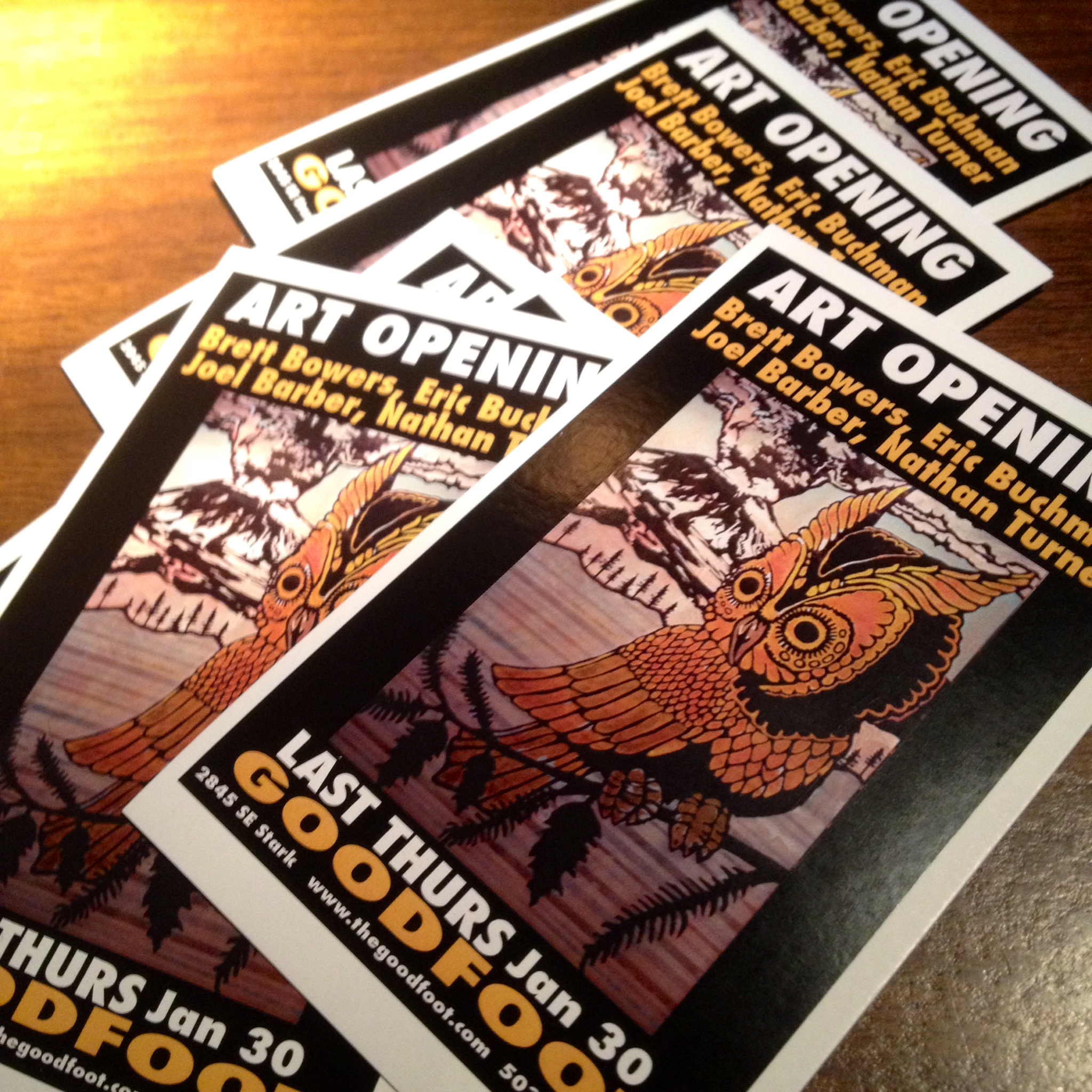
This art show will be a good way to share how I focus on a series. I have some finished pieces, that haven’t really been seen and I’m going to use this series as the basis for my work this month. There may be another series as well, but I’m going to just see how it goes. I’ll talk more about these pieces later — That’s my owl in the photo.
Here’s my progress so far:
Jan 1 – I slept in. It was a late night at work on NYE and I went to bed after sunrise, then slept past sunset! In the evening, I made a list of finished pieces that are new and ready to show. There’s 8 from the new Volcano series and stash of figure paintings that I’m not sure about including. I also brainstormed imagery for new work and made a good list. I’d like to paint an elk, some squid and octopus, maybe some salmon.
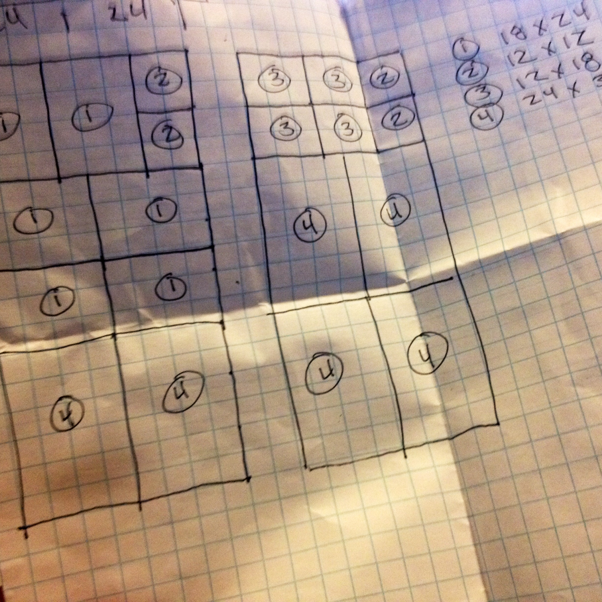
Jan 2 – I worked my day job and planned out cuts for wooden panels and linear feet of small lumber for cradling the sides. I build my own supports and have been researching smoother surfaces and denser wood for the sides, to prevent any warpage over time. I like the 24×36 inch size and want to add some smaller sizes so there’s a good range of price points.
coming up: building, prep work, more media, images
Face to Face
…some talk about stylistic choices.
I’m working backwards in time here, which is interesting to me, because these posts will appear in reverse order. When I sort some photos, I’ll talk about my creation process but for now I’d like to talk about my idea process during this series. Originally, my idea was to grid out nine panels 3×3 on the wall; however, I decided that should happen later and focus on color more than texture. These 8 panels (the ninth, incomplete) became quite textured as I compulsively added layers and pattern and I thought it best to display them so the audience can get close to each of them, as they have their own features.
Each of the eight started exactly the same, with a panel of mahogany plywood that was sanded and the sides boxed in. The same image (face) was mapped on all eight and, from here, the styles began to diverge. I have no concrete plan of execution when I begin, other than the starting point. Chance comes into play.

The first composition that I mapped was “Bump”. Using a slide of the very first painting in which I used this image, I project and trace the contour. Even my hand movements during this process, begin to create individual form. When I completed this linework and turned up the lights, I realized that the image was shifted about 8 inches to the left from where I’d intended. I bumped the panel! So, I decided that would be a good place for some text. The word “Bump” has so many connotations, that I couldn’t pass. When choosing a color scheme, I picked sexy colors that might be used in lipstick and eyeshadow. Bump alludes to dance clubs, sex, drugs, and loud music, so it seemed appropriate.
 Several more motifs developed after I had added the first two or three layers of color. I set all of the pieces outside, and stared them down while drinking my morning coffee. I made notes that I taped to the panels, based on the current feel of the color and how attached I was to the current level of awesomeness in the natural woodgrain or staining/glazing effect. I chose some warm and cool colors when shopping for this series, and began thinking about relationships and harmony. Color theory came into play here, more that usual. “Made It!” is essentially two themes: secondary colors (triad) and alternating stripe pattern. There are two shades of each color. The text/title, unrelated to the color scheme, refers to following thru with an idea. (Well, I guess I did follow thru with this theme, but it can relate to bigger issues…)

“Too Subtle?” is focused on analogous color (colors adjacent on the color wheel), in this case they are red/orange/yellow. I limited my use of pattern and alternated opaque color with transparent, which maintained the natural woodgrain. With some of the panels becoming quite abstract and pattern heavy at this point, it was important for me to keep a few pieces more simple and the values correct, so the face is more apparent.

“Maybe Knot” is one of the pieces that developed because of the woodgrain. There is a wonderful burl on the right side, which is somewhat obscured by the blue faux woodgrain. This piece was designated as blue/orange color scheme (complimentary colors) and the text was originally “knotty”, because I love the pun; however, I don’t like the way the word looks when I write it out. I like the balance of patterns here: dots, stripes, natural and faux woodgrain. All of my text was handwritten and stencil cut on the surface, some in positive and some in negative.

The faux woodgrain is a new technique for me. I’ve been interested in trying it for some time and have often talked about it with my friend and collaborator, Natalie Oswald. She uses it so effectively that I’ve witnessed people viewing a painting with pink woodgrain over collaged vintage magazine pages and say “Oh, I love it when people paint on wood.” No joke. In this faux piece, I attempted to give clues, by going against the natural grain at first, but then also alternating direction in other layers, and using very unnatural colors. I believe the early notes suggested “blue green pop”. I couldn’t bear covering the orange stain and natural/faux woodgrain combo, so the end scheme seems to be secondary-triad-with-some-blue…or (i’m nerding out here) purple/blue/green analogous with blue’s compliment: orange. That makes things symmetrical on the color wheel. I really think about these things…I know…maybe too much. Just wait, I’m working on converting these color harmonies into musical chords and vise versa. It will get nerdier.

The early notes that I made for “Spark” suggested that I exploit the iridescent copper that was used in the early washes, and I’d planned on adding some light blue to mimic patina. After a few more layers, some subtle woodgrain and richer colors, I was really getting the feeling of scorched wood. So rather than basing my color harmony on theory, I worked to suggest flame, singed wood, glowing coals and billowing smoke. The faux woodgrain, here, doubles as flame, the lips are dotted randomly to hint at glowing embers, and that copper underneath works to give ita all some glow. I enjoy the feel of this piece and will most definitely approach future pieces with this idea of mood.

A somewhat different approach was taken with this piece. I kept the palette simple: red/purple/blue (analogous). “Twice” describes the fact that I basically painted it two times. I did no spraypainting and did not mask the edges of any layers. I masked vertical stripes, evenly spaced, and then painted it all somewhat loosely, with a brush. Then I pulled the tape, and covered the stripes that I’d just painted and then re-painted everything (in the previous covered stripes). The result is two paintings, that occur in alternating stripes. It’s a pretty pleasing effect that I’ve been wanting to try again, since one of my collaboration experiments with Natalie. This was also a much less tedious process, since I didn’t have to apply and peel so much masking tape.
 It is interesting to me that “Crushed” seemed to get more compliments than the other pieces at the show. I think this is partially because my light and dark values are fairly accurate and the face reads easily. The simple palette is very close to so many of the early works that were done with this same composition, back around 2000-2003. It interests me that crushed is a word that means almost opposite things, but both are feelings that can be attributed to releationships/love. This is the last piece for this batch of eight, and the approach was slightly different, because I was not trying to keep any of the woodgrain in this one, or any of the early washes or glazes, which were not very interesting. My masking technique for most of the pieces works somewhat like this: I mask everything out, leaving only the area I’m going to paint, then I paint it, then I remove all of the tape and remask the area so that it is protected as I move on to new areas. (More on this in the future.) With “Crushed”, I worked in a sort of reduction process, like a woodblock print, painting a layer and covering it, painting the next layer and covering it and so on until it was all finished. Then I added the text, which is freehanded and hand cut.
These are some of my thoughts about each piece and the reason they look the way they do. I’ve not talked much about my masking techniques, glazing, color mixing, paint choices, mediums, stencils, etc. but I will in future posts. I’ve taken a lot of photos throughout the process, with this series and with many other paintings. I hope that you found this interesting; if so, please let me know and feel free to ask questions! Cheers!
