Art Show At The Goodfoot (Portland, OR)
I have an exhibit at at The Goodfoot! The opening was super fun and the show looks great. Art will be on display for most of February. My paintings are hanging along side the work of Nathan Turner, Brett Bowers and Eric Buchman. There’s some nice overlap in style and technique. Check out the work here: http://thegoodfoot.com/gallery/
I feel pretty accomplished with my work for the month of January. I started out with seven pieces from a show in September. That was the beginning of this series, called “Welcome To Cascadia”. In October, I finished a collaboration that Natalie Oswald, started while we were working on our mural in Tacoma. (Check out the Mural video here: https://www.youtube.com/watch?v=gpXaaUTX6K4.) In January, I Built 20 panels and painted backgrounds; I finished 14 new pieces. I also carved and printed two editions of linocuts and hung a few of the Analog Owls. I even printed about 50 custom drink coasters for the evening. I’ll probably finish a few more Analog Owls to add to the show next week.
I’ll keep posting the images from this show; here’s a few from the first batch.
 “Seekers”, 24×36 inches, Acrylic
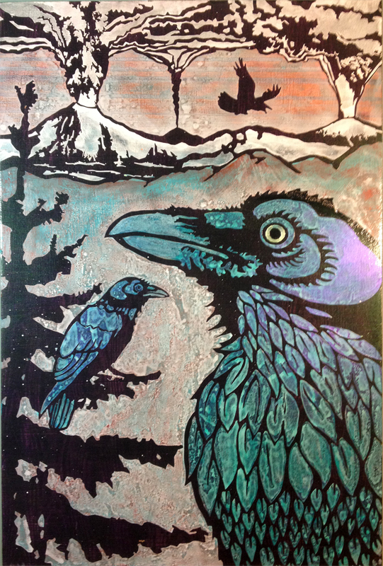
 “Hunter”, 24×36 inches, Acrylic
 “Migration”, 24×36 inches, acrylic (check out the purple iridescent in the reflection!)
 “Glow Koi”, 18×40 inches, acrylic. This is a collaboration with Natalie Oswald. We’ve done a lot of collaboration work over the years. You can see more of that here: http://natalieoswald.com/collab_picto.html. These collaborations are always influential to the way that I paint, both in approach and style.
Here’s a new version of the Koi that I made in January:
 “Alder Beetle”, 24×36 inches, acrylic
I’ve had a couple evenings at home, thanks to the snow in Portland. I’ve been taking a break from painting, to rest up and clean my house after the art bomb went off. I’ve been switching it up by doing some music related stuff, setting up my audio space and mixing a long dj set. I’ve also been doing some pinhole photography and carved a lino block for the Love Of Portland show. There’s a test print in my instagram feed. (below) I’ll post some links to prints for sale soon!
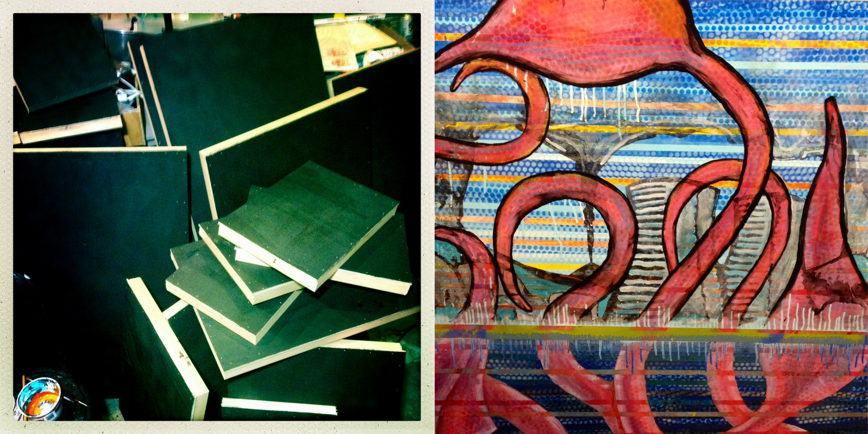
Sneak Peak – Tentacles (and WIP shots)
Friday. Finally, another full day for painting. I’m beginning to work out the final details on several pieces, have several mid-progress, and still a few to draw out (an elk, maybe). I’ll have three collaborative pieces in the show, and some block prints. Here’s a sneak peak at a couple new pieces. The shimmery effects don’t work much in photos, but a nice heavy clear coat will bring those out and the visual depth should be pretty cool. Sometimes all the layering pays off.
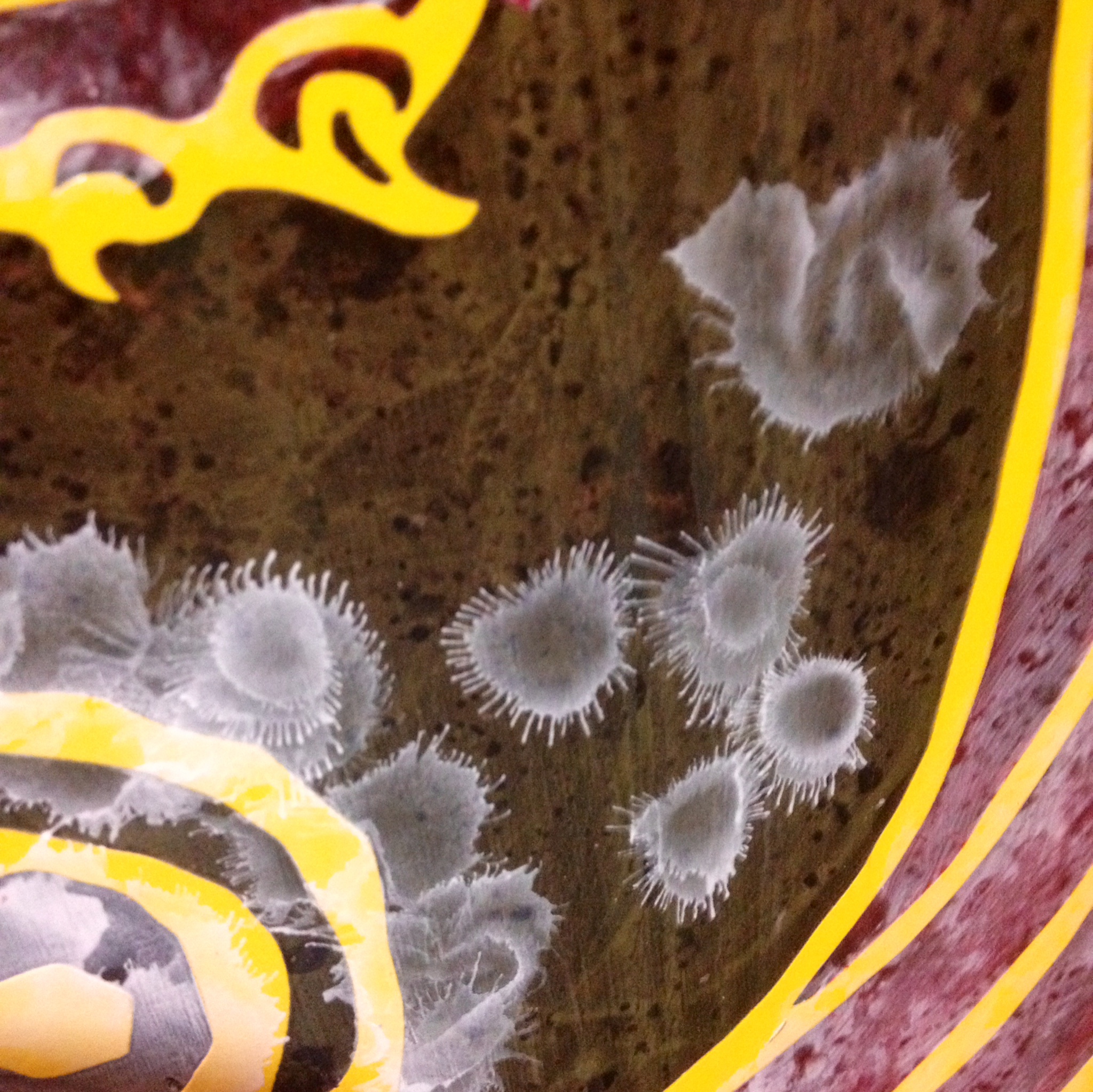
Pacific Octopus (detail, WIP)

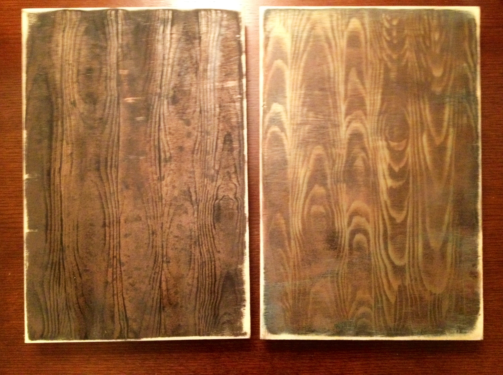
WIP (work in porgress), I masked the finished octopi and started a new woodgrain pattern for the background.

Colossal Squid vs Sperm Whale (Detail, WIP)
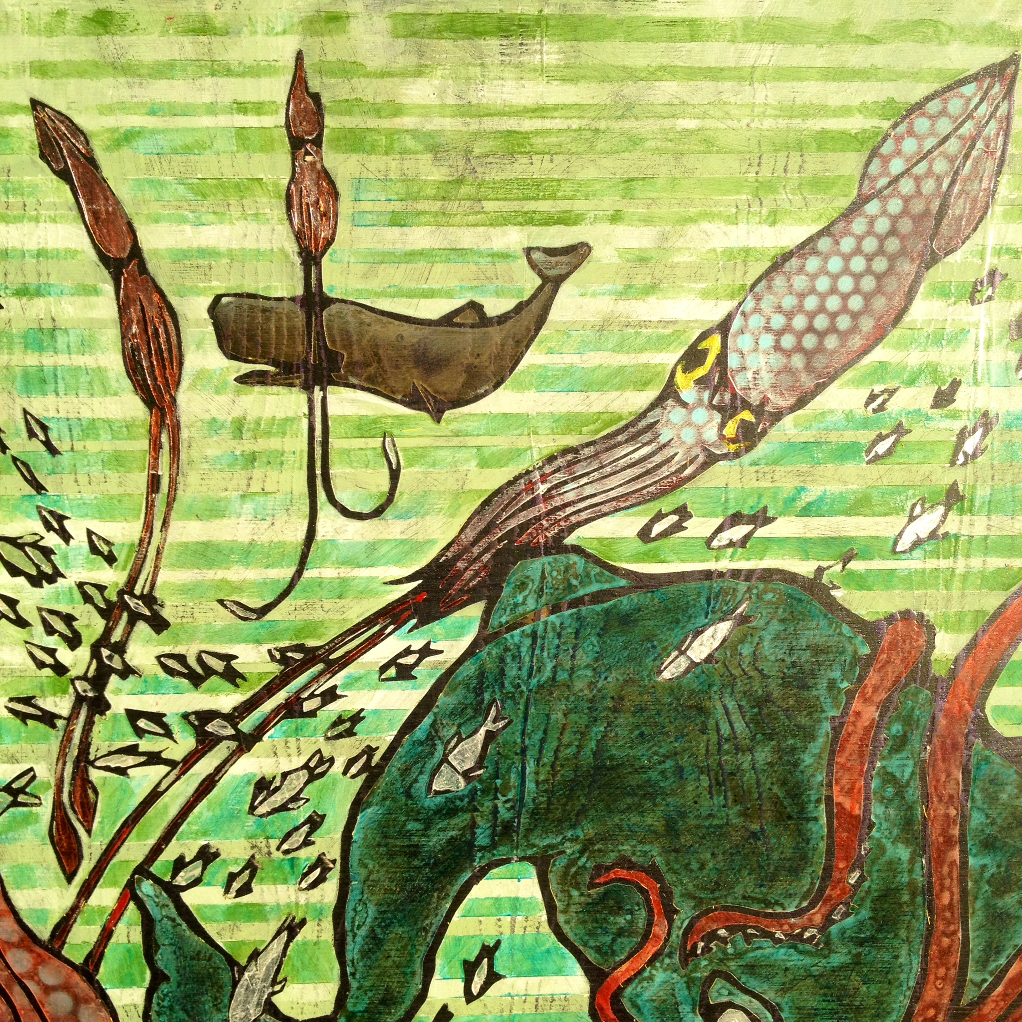
Work in Progress, whale textured:
WIP, some airbrush effect on the bigger whale. The yellow is the vinyl that is protecting the hard dark outline.
Just a few days left before the show. I’ll be finishing up several more new pieces this weekend. Also, posting more process shots in my instagram feed @artdamaged.
Art Studio progress (One Week to Goodfoot Show)
The last couple of days are a terrific blur. I’m in various stages of production, which you can see in the photo below. I’ve got finished backgrounds, a handful of completed pieces, some that are ready for collaboration, some that are masked and ready for paint. I took the photo in the day yesterday, then spent the night painting in squids, whales, and octopi.
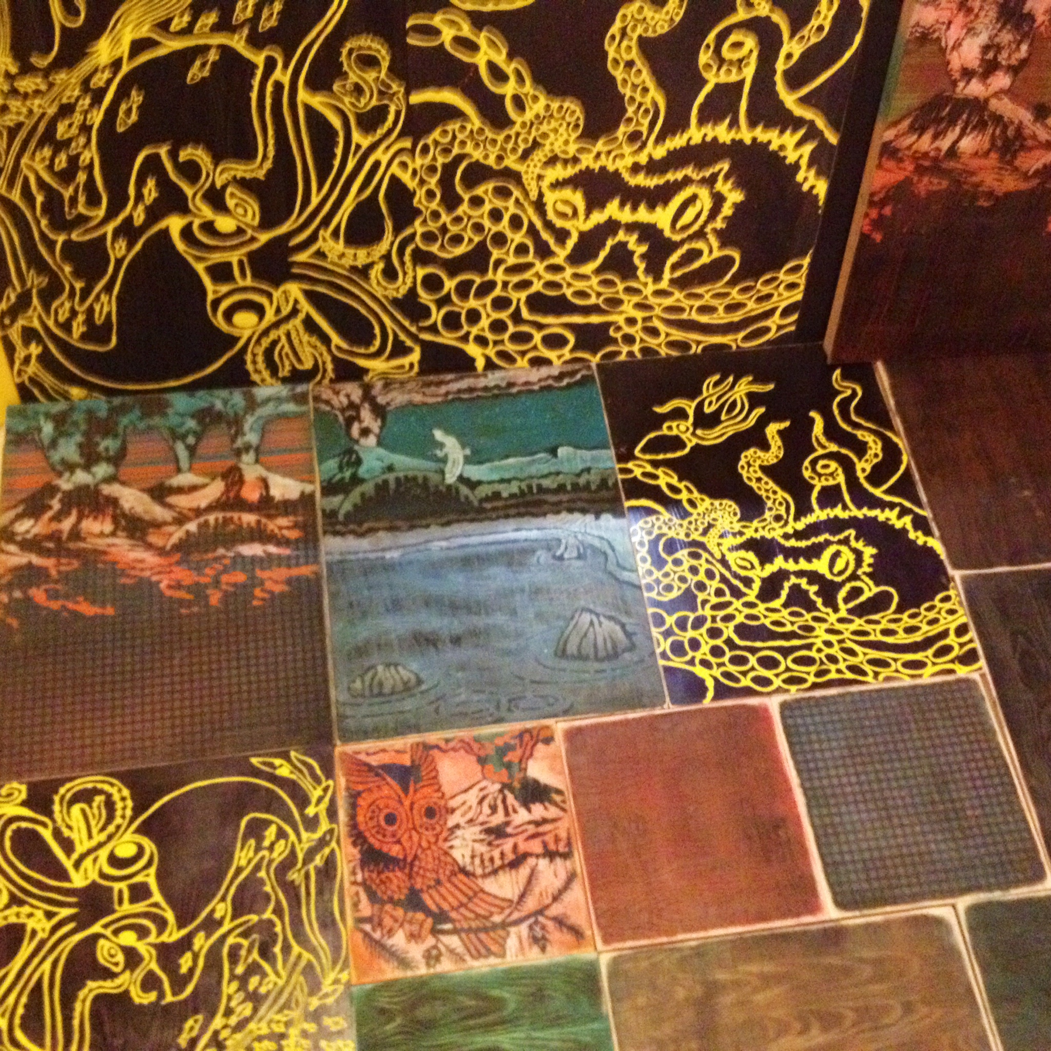
I’m posting progress shots as I go, via artdamaged instagram. (also, they may show up down at bottom of the page)
Art Show Progress (and Process) – Two Weeks To Go
The last week has been productive, but things are getting fun now! I started out the new pieces by layering up the panels: black primer, sanding, more primer or glazes of color, sanding, then back and forth with layers of metallics for shimmer and color shift effects. The order of the layering really affects the way the iridescent pigments react to the light. (I don’t have any of the formulas memorized; I just know something cool is likely to happen and I stop when I’m excited about it.) All of the woodgrain is painted on. I have a faux finishing tool that makes it pretty easy; the woodgrain gets layered in once or twice in the process. Once I’m happy with it, I try to make it pretty level and smooth, so it masks cleanly. This is the background layer.
For most of the images, I want this background to work as the “black” outline; why not make black complex and interesting. The aesthetic that I’m drawn to for this is sort of weathered patina with greenish and bronze or copper that’s stained and scuffed up.
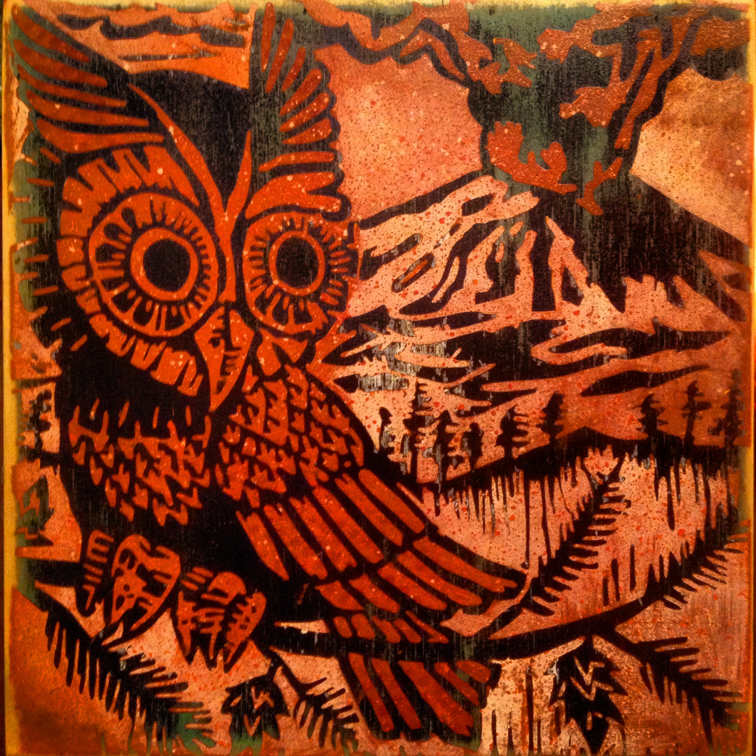
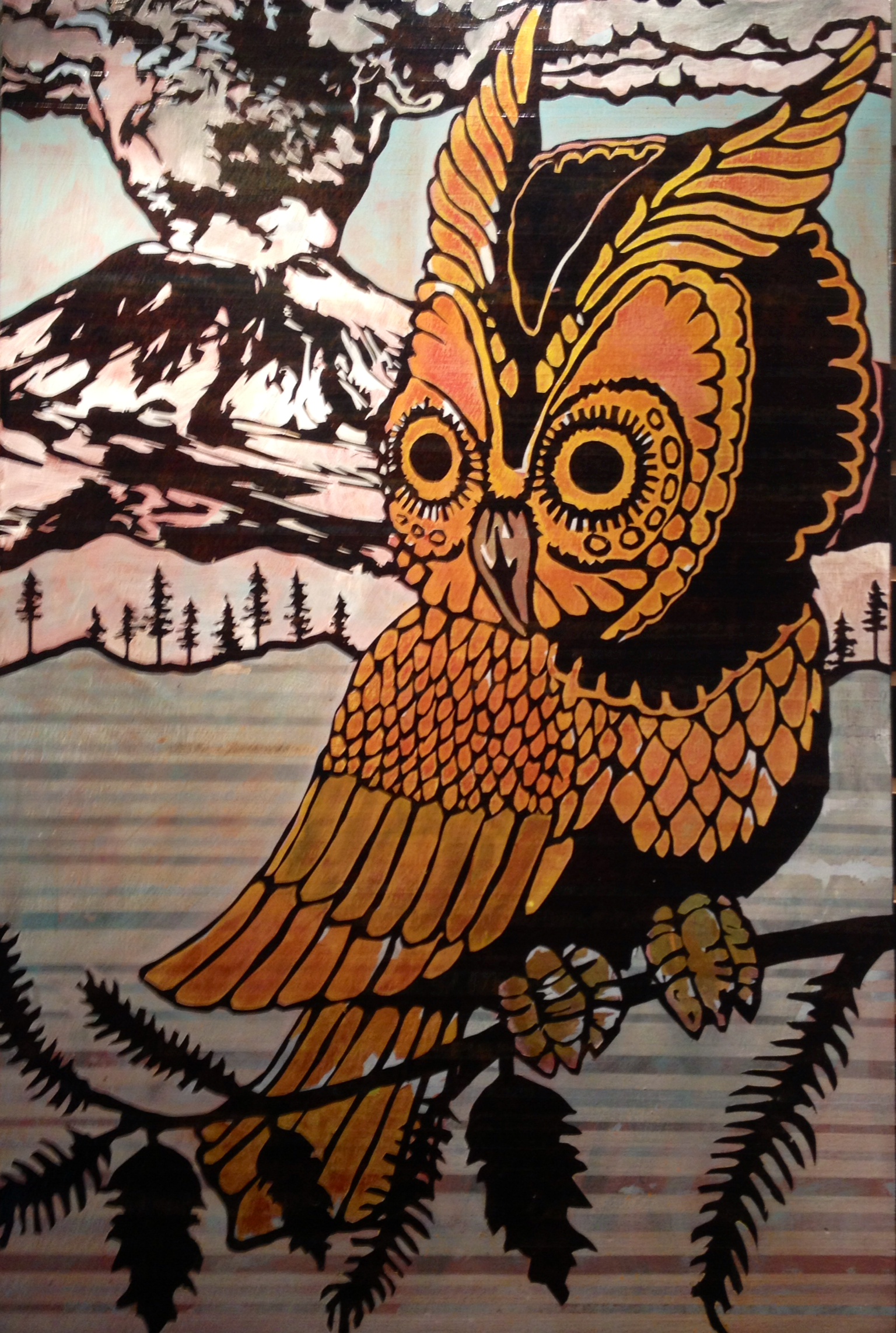
Once most of my panels were layered up, I was excited to do some illustration on top, so I painted an owl with a volcano. I enjoy making variants, versions, whatever. Themes/Motifs/Series within series. I like to try all the options; I used to get stuck trying to decide the best way to finish a piece. Now I like to see them all in context and appreciate how they relate to one another. Repetition adds a weird twist to how we think about the pieces too: how original is it? Is the print on wood have value over a print on paper? We think of prints as copies sometimes. When it’s painted, is that a print or a painting? — Yeah, this is the stuff that I think about during those hours of brushing layers and sanding; it’s very contemplative and zen. Haha! (for real tho.)
This is the newest one. It’s a little guy. 12×12 inches. Acrylic on wood panel.
I cut the stencil after working the image up in photoshop, from this photo of an 8×8 print:

I printed it from this block that I carved:

I sketched the block out, while looking at this painting:
I used the 8×8 block to print 6 pieces for the Big 400 Art Show. They looked like this:

There’s some bigger versions with a similar composition, one with mt. hood, one with multiple volcanoes. I’ll share those another time.
I’ve also drawn up two new compositions and I’m working on the stencils tonight. I’ll share designs and progress tomorrow. I expect to have illustrative images going down onto the bottom layers over the weekend! My schedule has been working in the early afternoon (day job) and then napping for about three hours, then studio arting from about ten until late (bed around 5 or 6am) then about five hours of sleep for the night. It’s working alright; tho, I think I prefer to get started in the afternoon so I’m in a groove by night time.
My new images are squids and octopi…More tomorrow!
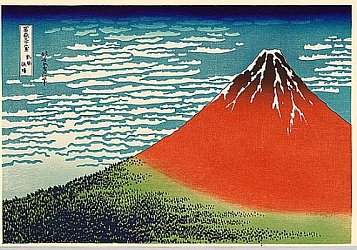
Volcanoes! (Boom For Real)
I remember the day that Mt. Saint Helens erupted. The big one, on May 18th, 1980. I have a photo album of newspaper clippings and a small canister of volcanic ash. It was a big deal for me as a kid. I didn’t make a specific decision to paint volcanoes, but somehow it keeps happening. (why doesn’t spell check catch “volcanos”? I really want to spell it without the e.)
This digital drawing was the springboard for this recent series:
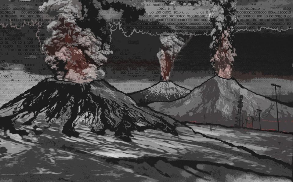
I grew up in the cold war, but never really worried too much about the Russians bombing us. I have friends that had “day after” type dreams fairly often. Me, not so much. I had a fair grasp of Mutually Assured Destruction. In recent decades, I’ve had a fair amount of dreams where volcanoes are erupting, including some flooding, landslides and Pompei-esque ash fallout. I don’t consider them nightmares though. Not so much scary, as intense. It’s a reality it the Pacific Northwest (and all of the Pacific Rim). Before we were here and long after…
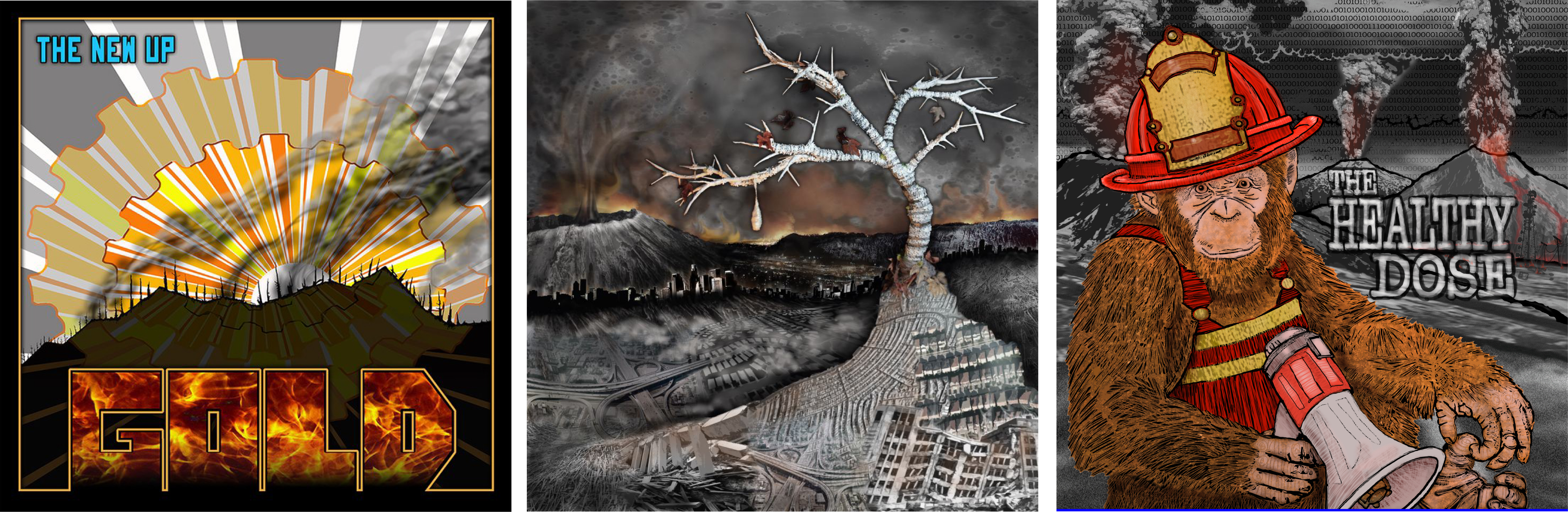
Over the last few years, I’ve done some album art for bands that I know and love. The requests for imagery weren’t specific in every case; however, some sort of volcano was the final result for these three! The image of the Cascade Range going off is something that I’ve been thinking about for some time, and that was part of The Health Dose back cover (and cropped for the front, below right). Mt. Saint Helens worked her way into the Fulero//Lehe cover (below middle, “Cocoon”). For The New Up “Gold” (below left), it was maybe a crater, but could also be a volcano.
Once again, I’ll mention that each piece in my new series has at least one volcano in it. I’m not sure how long that will be necessary, but for now, I like it (and the reference to “views of Mt. Fuji”). There’s somewhat of a narrative that is evolving around it, but I’m not ready to get into that. 😉 So far, I’ve represented Mt. Hood, Mt. St. Helens and Mt. Bachelor. I think I’ll add a few more locals. Maybe Adams and Rainier.
So, Here’s my work progress:
Jan 10: Today, I shopped for vinyl masking film and some cool spray paint colors. I worked the ol day job. I went by the goodwill and did some treasure hunting (I’ve been learning to fly my new remote control gyrocopter. Score!!). I gessoed up some black on 20 panels and painted outlines and a background on a giant squid painting. (both the squid and the painting are giant…) It was a studio session night with the homies, painting and eating snacks.
Coming up: Owls…
The Influence of Printmaking (on my artwork)
In college, I was a printmaker. I carved woodblocks, etched copper plates, printed from linoleum and lithograph stones, and pulled silkscreen prints. In the last decade, I’ve mostly been a painter; although, printmaking still affects my technique. Much of the masking work that I do with tape or vinyl film is derived from a reduction printmaking process. (Glossary: “Reduction” – With a reduction print, each color is created from the same block. Each color is printed, the block is carved with more detail, inked again and then the new color is printed on top of the previous – usually on paper. The entire edition must be printed at once, because the block is permanently changed with each color. A truly “Limited Edition”.)
HOKUSAI http://en.wikipedia.org/wiki/Hokusai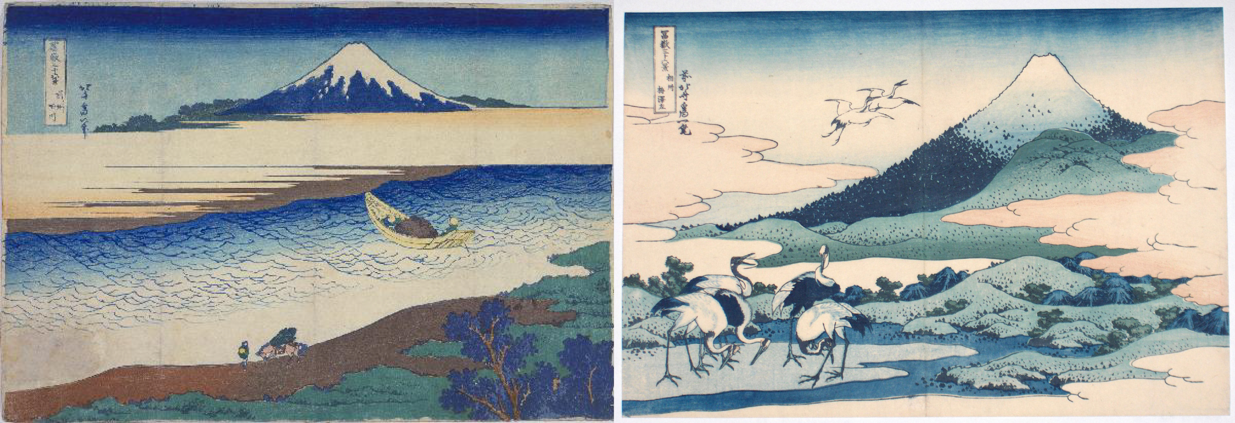
In addition to techniques, I’m drawn to the idea of editions, multiples, and variations (which are all concepts that are part of printmaking). Katsushika Hokusai is an artist that, for me, exemplifies the concept of exploring a theme. Having one thing that ties together a series, a springboard for experimentation, helps me narrow down the possibilities when deciding on imagery. The images above are from Hokusai’s “36 views of Mt. Fuji”. He also published “100 Views of Mt. Fuji”. I’ve repeated imagery in paintings because I like the context of using different colors, media, pattern on the same composition because it gives me a reference point for the subtleties, or even effectiveness, of each.
You’ll probably notice the influence of the Hokusai graphic print style, in my paintings. Also, once I realized that I had started several paintings with volcanoes in them – which reminded me of the Mt. Fuji series – I decided that I would include volcanoes in each pieces. I like the Mt. Fuji reference. I should probably write about volcanoes next…
Progress:
Jan 6: I spent the day cleaning up the stencil design for my commission, then cutting the vinyl mask, and painted into the wee hours. I met with Johnny Luczycki, to discuss ideas about collaboration images and process/style.
Jan 7: I worked my day job. I shopped for Gesso (Glossary: “Gesso” is a painting primer that will prep nearly any surface for painting. It seals the surface and contains some grit that helps give “tooth” to the surface to help the paint adhere.) and tried to locate some soft block printing material in larger sheets. I didn’t find what I needed. Worked my night job.
Jan 8: Worked my day job. Bought some black gesso since I’ll be starting out with dark colors, this will make it easy to cover. I napped. I painted some panels with gesso. I’ll need a few coats, plus sanding between coats to get the surface smooth.
Jan 9: Tired. Slept late. I’m going to gesso the rest of the panels tonight. Make a shopping list for tomorrow. I need some things before the weekend!
Next…What’s up with the volcanoes? maybe actual art images from this series…
Progress/Process (January Art Show) Day 5
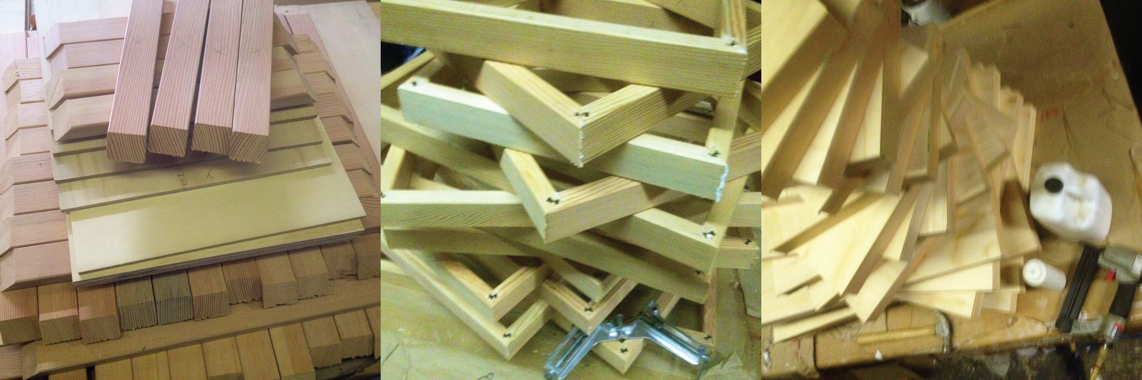
I’ve learned that one of the best ways to get inspired to start painting is to prepare the support. (Glossary: “Support” – I like this generic term for the substrate that will be painted on. It can be a stretched canvas, panel, paper, found item, etc.) Building and priming the supports is a great way to get into the studio or workshop and get hands on; it’s a great way to brainstorm and think about sizes and composition while completing necessary prep work.
Most recently, I’ve been working on wooden panels. It’s rigid and great for masking, stenciling, and cutting directly on the surface. I can really work the surface, sand, distress, scratch, etc. without stretching or ripping that might happen on a canvas. I like the simple presentation of a cradled plywood panel. (Glossary: “Cradled” – a simple frame creates depth to the sides and strength to the support. The panel is attached to the front of the frame so the painting surface extends edge-to-edge.)
Materials: I’ve been using Luan Mahogany plywood for a few years. It’s lighter, stronger and not much more expensive than masonite. It wont swell from moisture like masonite (pressed saw dust panels). The appearance of the mahogany surface can be really striking and stains nicely. I like to take advantage of the woodgrain. The first pieces in this newest series presented a few challenges because of al the sanding that I did, trying to get a super smooth surface. The top veneer of Luan is thin and porous and sanding made it reee-eally thin at times. I had issues with the veneer lifting/tearing off when I pulled the adhesive mask that I use for stenciling. This round, I’m trying new wood products. I chose a thicker pine plywood with only three layers that are fairly thick; also, I am using a very straight grained fir for the sides to prevent warping. The materials were more than twice as much, but still very affordable because I’m building them myself.
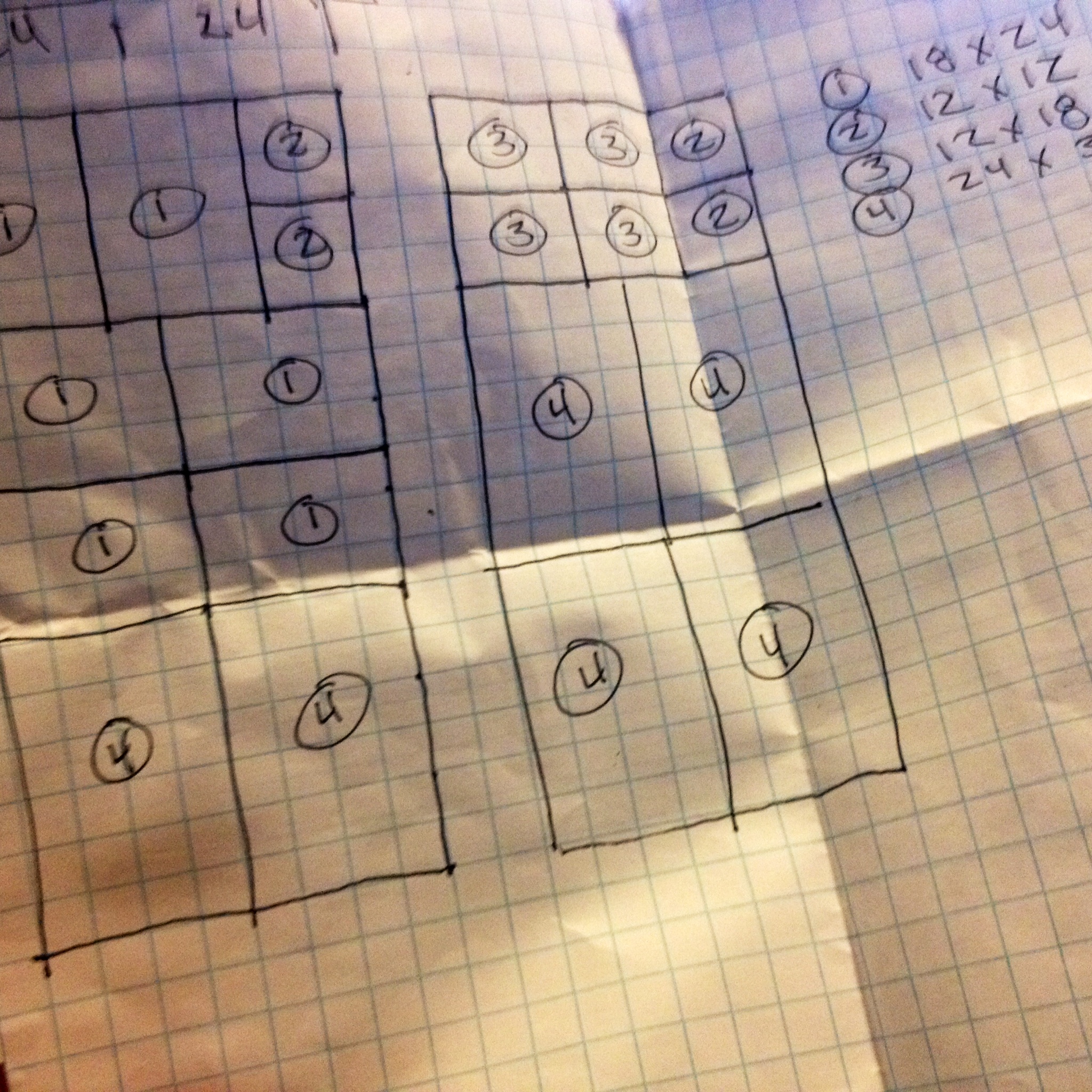
I had the plywood cut to size when I bought it. I cut down all of the sides on a miter cutter, prior to assembly. Using sizes that share one dimension, made production simple (36×24. 24×18, 18×12, 12×12). Also, very little waste. The entire sheet of plywood was used. Next, I routed, glued and pinned the corners like a picture frame. Once all of the frames were assembled, I glued the top of the frame and set the panel on top, lined it up and nailed it on (with an air powered brad gun). I’m priming the surface on these so I’ll be filling the nail holes. Glue and clamps would work if I didn’t want nail holes to show on a natural woodgrain surface.
Progress:
Jan 3: I purchased lumber. I worked my day job. I read a book. (I’ve avoided the uber-distraction of internet TV so far, this month.)
Jan 4: I cut down frames for cradled sides. I drove to the Pearl District and picked paintings up from a show, ate chinese food, drove home and napped. I went back to the shop and assembled panels. I worked night job.
Jan 5. I’ve slept most of the day (remember, night job…) and played some drums. Now I have some design work to do for a commissioned painting that needs attention.
Coming up: illustration techniques, more materials, thematic ideas…probably more napping.
Happy 2014! (Time To Revive This Blog)
Time passes quickly and things have distracted me from this blog. The Globe closed in late 2011 so my curation of that venue ended. Also, I bought a house and began setting up my new studio space. I’ve been busy; however, most of my sharing has been via Facebook and Instagram. One of the reasons that I began this blog was to share some of my process and that’s what I’m here to do this month. I have an art opening on January 30th and will do my best to share the progress and process via images and technical descriptions. I’ll be open to questions, feedback, suggestions; I’m down to talk shop and hear any ideas you’d like to share. At this point, I’m not even sure if anybody is going to see this, so it’s an experiment.
This art show will be a good way to share how I focus on a series. I have some finished pieces, that haven’t really been seen and I’m going to use this series as the basis for my work this month. There may be another series as well, but I’m going to just see how it goes. I’ll talk more about these pieces later — That’s my owl in the photo.
Here’s my progress so far:
Jan 1 – I slept in. It was a late night at work on NYE and I went to bed after sunrise, then slept past sunset! In the evening, I made a list of finished pieces that are new and ready to show. There’s 8 from the new Volcano series and stash of figure paintings that I’m not sure about including. I also brainstormed imagery for new work and made a good list. I’d like to paint an elk, some squid and octopus, maybe some salmon.
Jan 2 – I worked my day job and planned out cuts for wooden panels and linear feet of small lumber for cradling the sides. I build my own supports and have been researching smoother surfaces and denser wood for the sides, to prevent any warpage over time. I like the 24×36 inch size and want to add some smaller sizes so there’s a good range of price points.
coming up: building, prep work, more media, images
Face to Face
…some talk about stylistic choices.
I’m working backwards in time here, which is interesting to me, because these posts will appear in reverse order. When I sort some photos, I’ll talk about my creation process but for now I’d like to talk about my idea process during this series. Originally, my idea was to grid out nine panels 3×3 on the wall; however, I decided that should happen later and focus on color more than texture. These 8 panels (the ninth, incomplete) became quite textured as I compulsively added layers and pattern and I thought it best to display them so the audience can get close to each of them, as they have their own features.
Each of the eight started exactly the same, with a panel of mahogany plywood that was sanded and the sides boxed in. The same image (face) was mapped on all eight and, from here, the styles began to diverge. I have no concrete plan of execution when I begin, other than the starting point. Chance comes into play.

The first composition that I mapped was “Bump”. Using a slide of the very first painting in which I used this image, I project and trace the contour. Even my hand movements during this process, begin to create individual form. When I completed this linework and turned up the lights, I realized that the image was shifted about 8 inches to the left from where I’d intended. I bumped the panel! So, I decided that would be a good place for some text. The word “Bump” has so many connotations, that I couldn’t pass. When choosing a color scheme, I picked sexy colors that might be used in lipstick and eyeshadow. Bump alludes to dance clubs, sex, drugs, and loud music, so it seemed appropriate.
 Several more motifs developed after I had added the first two or three layers of color. I set all of the pieces outside, and stared them down while drinking my morning coffee. I made notes that I taped to the panels, based on the current feel of the color and how attached I was to the current level of awesomeness in the natural woodgrain or staining/glazing effect. I chose some warm and cool colors when shopping for this series, and began thinking about relationships and harmony. Color theory came into play here, more that usual. “Made It!” is essentially two themes: secondary colors (triad) and alternating stripe pattern. There are two shades of each color. The text/title, unrelated to the color scheme, refers to following thru with an idea. (Well, I guess I did follow thru with this theme, but it can relate to bigger issues…)

“Too Subtle?” is focused on analogous color (colors adjacent on the color wheel), in this case they are red/orange/yellow. I limited my use of pattern and alternated opaque color with transparent, which maintained the natural woodgrain. With some of the panels becoming quite abstract and pattern heavy at this point, it was important for me to keep a few pieces more simple and the values correct, so the face is more apparent.

“Maybe Knot” is one of the pieces that developed because of the woodgrain. There is a wonderful burl on the right side, which is somewhat obscured by the blue faux woodgrain. This piece was designated as blue/orange color scheme (complimentary colors) and the text was originally “knotty”, because I love the pun; however, I don’t like the way the word looks when I write it out. I like the balance of patterns here: dots, stripes, natural and faux woodgrain. All of my text was handwritten and stencil cut on the surface, some in positive and some in negative.

The faux woodgrain is a new technique for me. I’ve been interested in trying it for some time and have often talked about it with my friend and collaborator, Natalie Oswald. She uses it so effectively that I’ve witnessed people viewing a painting with pink woodgrain over collaged vintage magazine pages and say “Oh, I love it when people paint on wood.” No joke. In this faux piece, I attempted to give clues, by going against the natural grain at first, but then also alternating direction in other layers, and using very unnatural colors. I believe the early notes suggested “blue green pop”. I couldn’t bear covering the orange stain and natural/faux woodgrain combo, so the end scheme seems to be secondary-triad-with-some-blue…or (i’m nerding out here) purple/blue/green analogous with blue’s compliment: orange. That makes things symmetrical on the color wheel. I really think about these things…I know…maybe too much. Just wait, I’m working on converting these color harmonies into musical chords and vise versa. It will get nerdier.

The early notes that I made for “Spark” suggested that I exploit the iridescent copper that was used in the early washes, and I’d planned on adding some light blue to mimic patina. After a few more layers, some subtle woodgrain and richer colors, I was really getting the feeling of scorched wood. So rather than basing my color harmony on theory, I worked to suggest flame, singed wood, glowing coals and billowing smoke. The faux woodgrain, here, doubles as flame, the lips are dotted randomly to hint at glowing embers, and that copper underneath works to give ita all some glow. I enjoy the feel of this piece and will most definitely approach future pieces with this idea of mood.

A somewhat different approach was taken with this piece. I kept the palette simple: red/purple/blue (analogous). “Twice” describes the fact that I basically painted it two times. I did no spraypainting and did not mask the edges of any layers. I masked vertical stripes, evenly spaced, and then painted it all somewhat loosely, with a brush. Then I pulled the tape, and covered the stripes that I’d just painted and then re-painted everything (in the previous covered stripes). The result is two paintings, that occur in alternating stripes. It’s a pretty pleasing effect that I’ve been wanting to try again, since one of my collaboration experiments with Natalie. This was also a much less tedious process, since I didn’t have to apply and peel so much masking tape.
 It is interesting to me that “Crushed” seemed to get more compliments than the other pieces at the show. I think this is partially because my light and dark values are fairly accurate and the face reads easily. The simple palette is very close to so many of the early works that were done with this same composition, back around 2000-2003. It interests me that crushed is a word that means almost opposite things, but both are feelings that can be attributed to releationships/love. This is the last piece for this batch of eight, and the approach was slightly different, because I was not trying to keep any of the woodgrain in this one, or any of the early washes or glazes, which were not very interesting. My masking technique for most of the pieces works somewhat like this: I mask everything out, leaving only the area I’m going to paint, then I paint it, then I remove all of the tape and remask the area so that it is protected as I move on to new areas. (More on this in the future.) With “Crushed”, I worked in a sort of reduction process, like a woodblock print, painting a layer and covering it, painting the next layer and covering it and so on until it was all finished. Then I added the text, which is freehanded and hand cut.
These are some of my thoughts about each piece and the reason they look the way they do. I’ve not talked much about my masking techniques, glazing, color mixing, paint choices, mediums, stencils, etc. but I will in future posts. I’ve taken a lot of photos throughout the process, with this series and with many other paintings. I hope that you found this interesting; if so, please let me know and feel free to ask questions! Cheers!
Crushed at the Goodfoot!
Art Show: Goodfoot. (Portland, OR)
Showing now through March.
I’m excited to have a featured show at the The Goodfoot. Curated by Jason Brown (and Chris Haberman), it is one of my favorite art venues in Portland. I’ve been a fan of the Goodfoot Lounge since they opened ten years ago, enjoying the live music in what some have called “Portland’s Livingroom”. The upstairs, however, is a few years newer, more spacious with high ceilings, and ample wall space. The reputation as “an artist hang-out” seems appropriate; it’s definitely one of my hot-spots.
This show features Adam Sheppard, Johnny Tragedy, Tripper Dungan, and Joel Barber (That’s Me). Although, our themes and styles vary, we all sure like to use color! My contributions include my “Interface(redux)” series, which was finished moments before the show opened, and a recent series that I call “Just Add Water“. It’s satisfying for me to show these two series together, as they represent abstractions of two elemental subject matters: landscape and the figure.
This is a paragraph from the artist statement for the show:
Joel’s work has often paired mechanical techniques and graphic design style with painterly texture, and natural material such as woodgrain. The influence of pop culture, graffiti art, and graphic design affect his interpretations of traditional landscape and figure. Visually, Barber dwells in the area where there is an oscillation between the paint on the surface and the image contained within.

Face Time! New Painting Series.
-
-
-
-
- These images are from my first painting series of 2011. I will probably continue with this series for a while; these are the first 8 to be completed, for a 4 person show at Portland’s Goodfoot. One reason that I’ve started this blog is to document some of my process and technique. This series will give good context for in-process photos because the repeated image will provide us with some visual context. Here’s a paragraph from my artist statement for the Goodfoot show:
-
 “Crushed” Joel Barber (2011) 40×30 inches, acrylic on mahogany
“My first very prolific series began in 1999, in which I manipulated closely cropped photos of women’s faces, with photoshop, and used these images to map out compositions on canvas. It was an excellent experiment because the repetition gave great context and a reference point for the effectiveness of each style or technique. Now, I’ve returned to these same compositions, curious to see how the last decade has affected me stylistically.”
 “Made It!” Joel Barber (2011) 40×30 inches, acrylic on mahogany
"Faux." Joel Barber (2011) 40x30 inches, acrylic on mahogany
 “Maybe Knot” Joel Barber (2011) 40×30 inches, acrylic on mahogany
 -
 “Spark” Joel Barber (2011) 40×30 inches, acrylic on mahogany
 -
 “Too Subtle?” Joel Barber (2011) 40×30 inches, acrylic on mahogany
 -
 “Twice” Joel Barber (2011) 40×30 inches, acrylic on mahogany
 -

 “Bump” Joel Barber (2011) 40×30 inches, acrylic on mahogany
