All The Secrets Revealed!
We all just do the best with the tools and resources that we have. It’s nice to have a plan and there’s usually adjustments to be made. I’ve always wanted the bumper sticker that says “Plan on improvising”. I do a lot of planning before the paint hits the panel; then I’m just winging it, really. I enjoy all of the different elements involved and the layering can be a memory exercise. I’m going to share some of my steps here, because it’s not always easy to explain verbally. The final painting is 100% acrylic paint on mahogany plywood panel. My techniques are influenced by reduction woodblock printing, silkscreen printing, and stenciling (but with adhesive similar to airbrush frisket masking film).
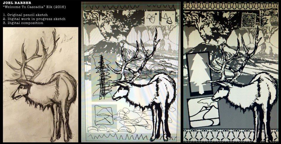
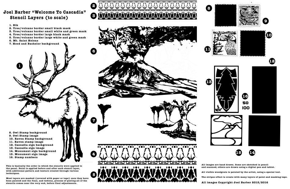
Once I’m happy with my composition, I decide which elements will need to be painted first. I finalize the drawing then cut the stencil out of adhesive vinyl sheets, using a computer driven cutter/plotter machine. I like to call this my “robot intern”. Stencil proportions usually change so I cut and apply the masking as I go (not all before I start). I use acrylic artist spray paint, acrylic liquid paint and some acrylic medium. I start with a general color scheme idea and choose pattern, visual texture, color combinations along the way. In the middle image above, you can see that I was going to draw city domes in the distance and mimic that with rock cairns up close; however, I decided that would be too busy once the pattern was down. Maybe that would be a good version if I skip the signs up front…Here’s some process shots below. Masking the elk after striping it up, the second layer of tree/volcano border stencils lined up and applied, and workspace on the panel just after pulling paint to make the woodgrain on the signs.

Below, I’ve created an exploded view of sorts in order to share all of the masking layers that were applied to the panel. There’s a lot of painting and mess making before and after each layer is applied. At the end, I peel all of the stencils up. That was really tedious with this piece because there were so many layers of paint that the vinyl came off in small bits. It’s still exciting to reveal the (almost) final product. Once I removed all of the tape and masking vinyl, I glazed in some transparent white in the sky and ash clouds and gave the stamps a postage value. After some gentle washing and sanding, a nice glossy clear coat helps create some visual depth in the patterns and boosts the contrast of the texture. ~ JB
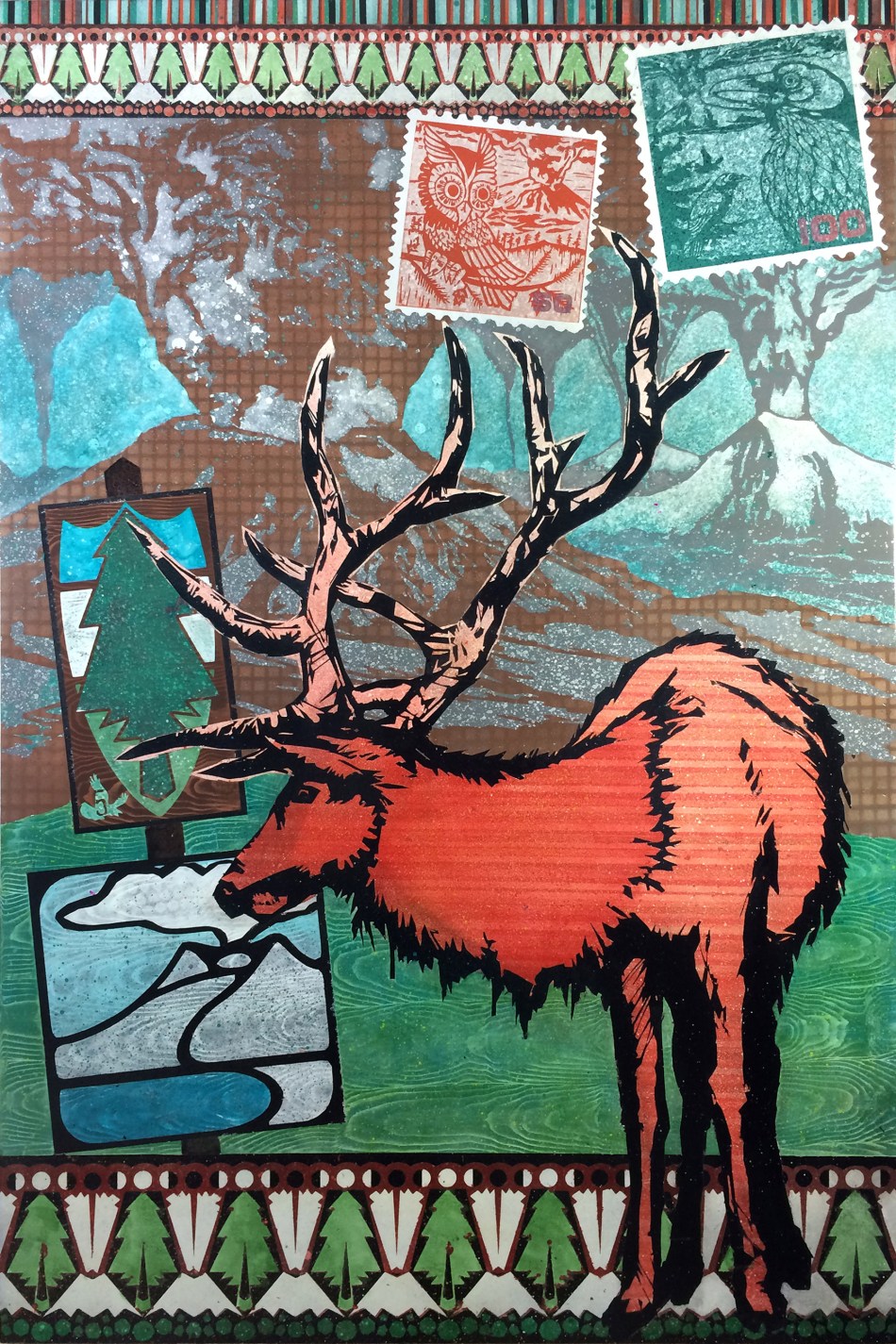
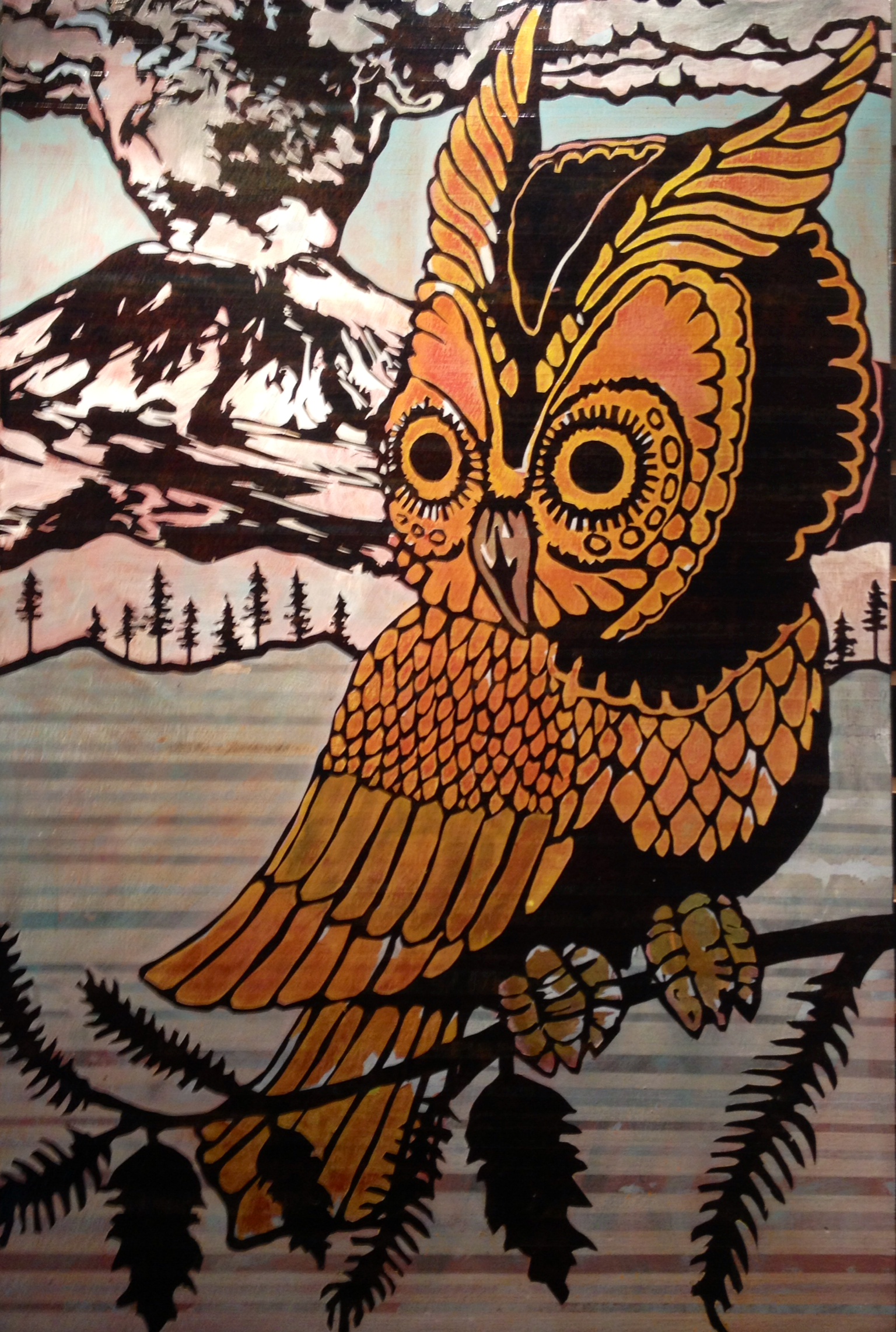
Here’s how this turned out. It’s 32″ x 48″. I’m going for something like an old National Park poster or post-card (obviously, stamps) and the border reminds me of a hiking sweater or wool blanket design. The volcano sign is based on the National Volcanic Monument signs, and the top sign is meant to look like a trail marker (with reference to the flag of Cascadia and the Interstate-5 badge).
If you would like to see this in person (or bring in home with you!), visit my show at The Gallery At The Jupiter Hotel in Portland, thru March.
2016 Happy New Year!
So…looks like I’m a once-a-year blogger…Happy 2016. I had a great year; lots of art and some fun shows. Obviously, I was not blogging. I suppose that I should do it more because this is the place for indulging in nerdy art talk. If you’re here, then you’ve chosen to read this; it’s not like I’m just blowing up your Facebook feed. If you’re interested in more regular photos of what I’m doing, I’d suggest finding me on instagram @artdamaged. I’m much more active there than anywhere else.
Do you follow astrology/horoscope? I have some knowledge of that sort of thing but it’s not like I read my horoscope often. I do know that Jan 5 – 25 was Mercury Retrograde. I called it out, too. On Jan 5, I experienced a wave of super stereotypical and cliche Merc. Retro. events. I decided to look it up and retrograde had started that day. Now, once again, I’m not saying that the planets rule our lives, but I’m thankful that I realized what was going on in the sky because it reminds me to be flexible in my plans, to roll with the punches. That’s good advice always, but its easy to be stubborn and expect to get our way.
I have an art show opening soon. My schedule had been cleared for a full month of studio production. Here’s the way things went for the first few days:
-I bought vinyl mask and transfer tape and dropped a 18″ wide roll of transfer tape in a deep puddle on the way to my car.
-I updated my OS on my laptop and now many drivers are not supported
-I had some software issues because of this as well
-The cold weather and new carpeted location of my plotter/vinyl cutter was charged with static electricity which kept zapping the motherboard and freezing up. That took a lot of trouble shooting and wasted vinyl to figure out.
-I had to relocate my setup and boil water to humidify the room
-this batch of vinyl was pretty sticky and hard to peel
-I seemed to have a lot of text and email communication issues
-I built panels that are bigger than the vinyl I’m able to cut, so I had to apply stencils in sections.
I made it work. I tried new things. I drew some new images and worked with way more stencil layers than I have before. I used 16 layers of stencil on one piece! (usually, it’s been one or two). I enjoyed the larger size too! I got to paint a lot more detail. I also painted a large samurai which was super fun to paint and I was able to cut details that I just couldn’t do with the smaller sizes.
The show looks great and I’m proud that I stayed focused, applied my best trouble shooting skills and solved the problems. I hung the show at The Jupiter Hotel, here in Portland and it will be up thru March. If you are in the area, please check it out. If you go see a show at The Doug Fir Lounge, stop into the gallery because they are open 24/7. I’ll post more about the show soon!
So, Mercury is no longer Retrograde. If you’ve had difficulties with your New Year projects, maybe things will go more smoothly now.
Welcome To Cascadia: Collaborations.
My first two shows at the Goodfoot, were 2004 and 2005. Natalie Oswald and I worked together to create series of collaborations that we did in a improvised style, working on them at the same time, passing pieces back and forth. Some great work came out of it and I learned a lot each time, lessons that I apply to my solo work as well. Some concepts are Non-attachment to the outcome or the object, being open to new techniques, learning from others and being willing to share ideas and techniques because it only progresses a style/movement/scene.
This series has four collaborations so far. Natalie painted/printed the background for the “Glow Koi” piece. It has some neat gold iridescent effect on top of the fish print. I finished one piece and here is a detail of a second piece that she started, same as the one I finished.
 Detail, Natalie Oswald koi block print (became background for “Glow Koi”)
I like working with artists that I know will bring their best effort and do something rad even if it’s not what I expect. For this series, I had requests as to what I wanted them to add, but was open to however they wanted to do it. Heather DeWitt does some super cool miniature scenes, so I asked her for a forest to put on a shelf in the foreground of my first volcano painting. She made a partially burned treeline and we co-painted the ground and trees.
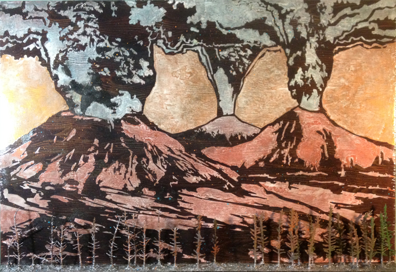 “Welcome To Cascadia”, Collaboration with Heather DeWitt, 36×24 inches
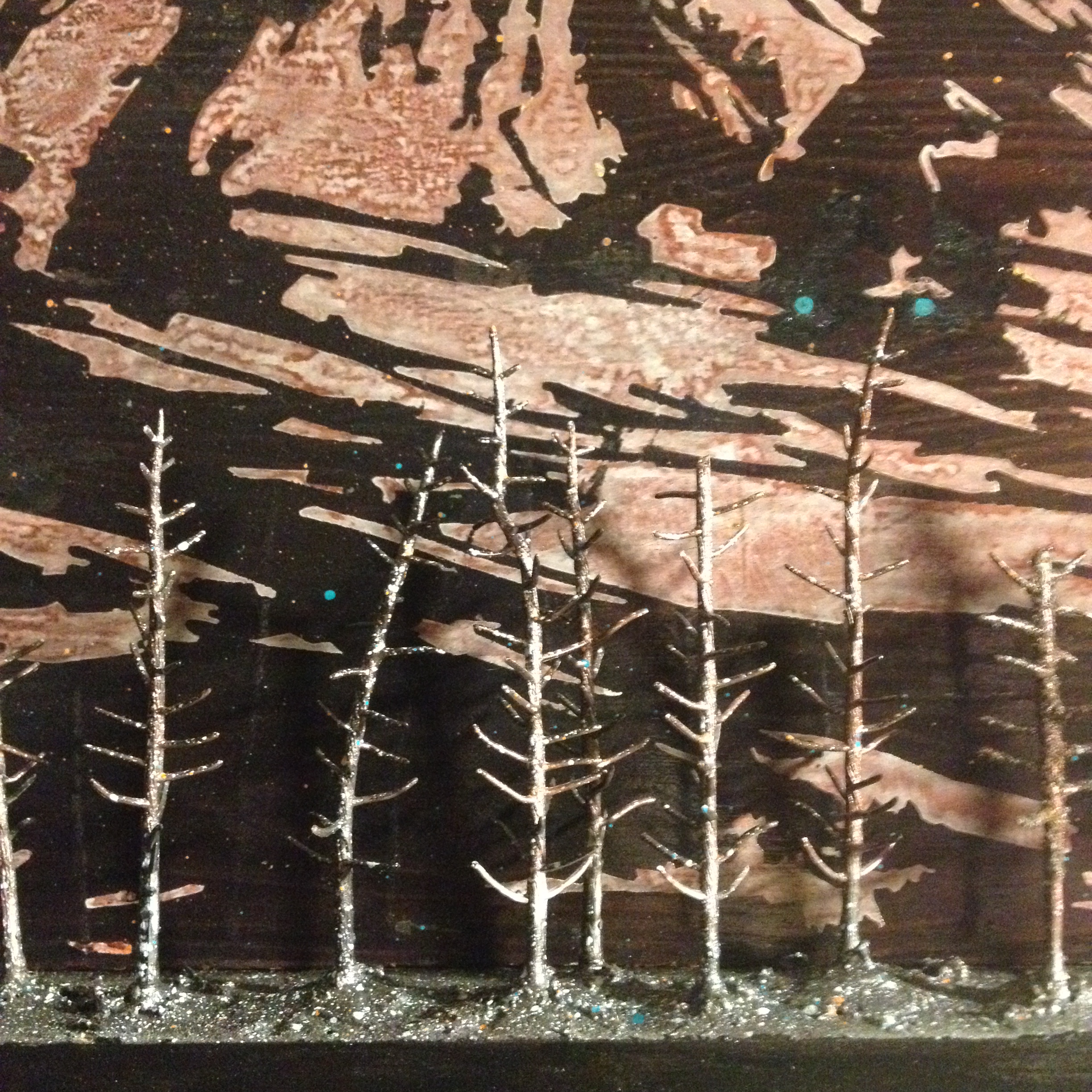 Detail, Collaborative forest, With Heather DeWitt
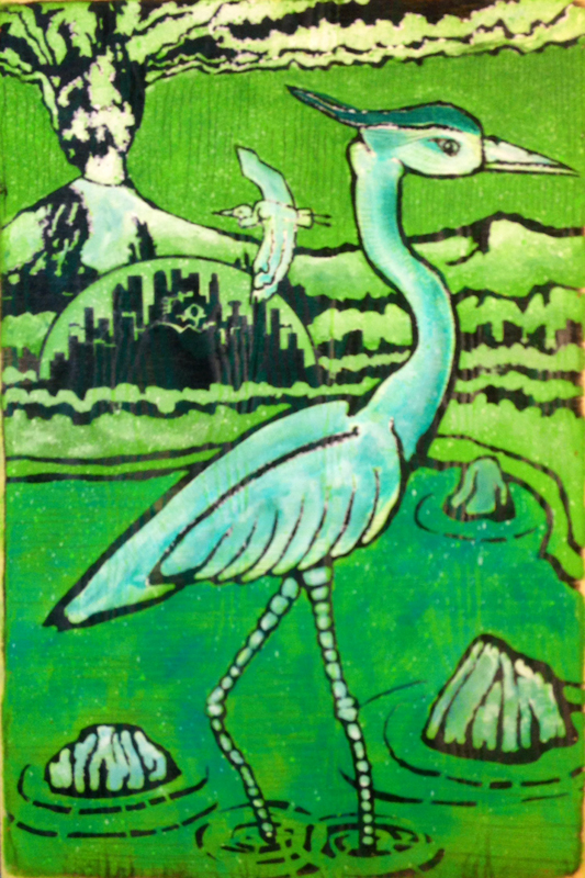
For years, I’ve loved the cranes and herons that Heidi Elise Wirz paints and draws. I saw a crane that she did for the Brink show here in Portland, so asked if she’s do a version of my heron piece. I gave her the same background scene that I’d worked with and she did this:
 “Fire Crane” 18×24 inches, with Heidi Elise Wirz
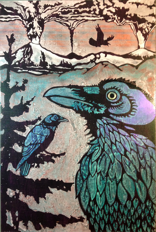
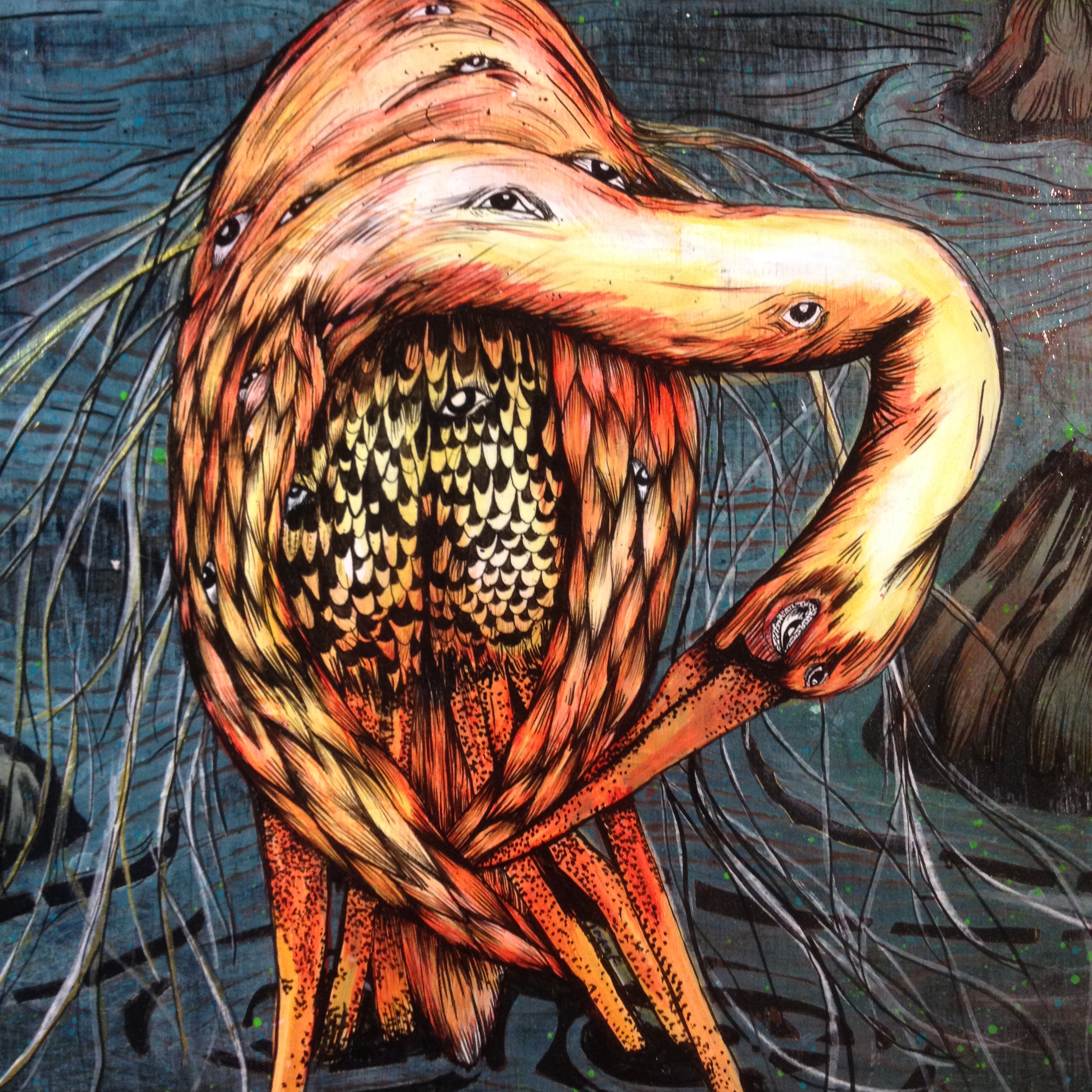 Detail, Fire Crane, I love that she took the sci-fi element to a new level with the mutant version of the crane! Lots of linework and stippling!
I had a few ideas for Jonny Luczycki, but with the show approaching we settled on a samurai. The samurai is an element that worked its way in because of the Japanese print influence. Now it’s part of the narrative in this future world. Why samurai? I like the idea that it’s a return to old ways. It makes sense to me that in the potential destruction of cities, collapse of the technology grid, etc. that the bad asses would return to a simple and noble code.
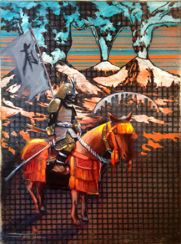 “The Way”, 18×24 inches, with Jonny Luczycki
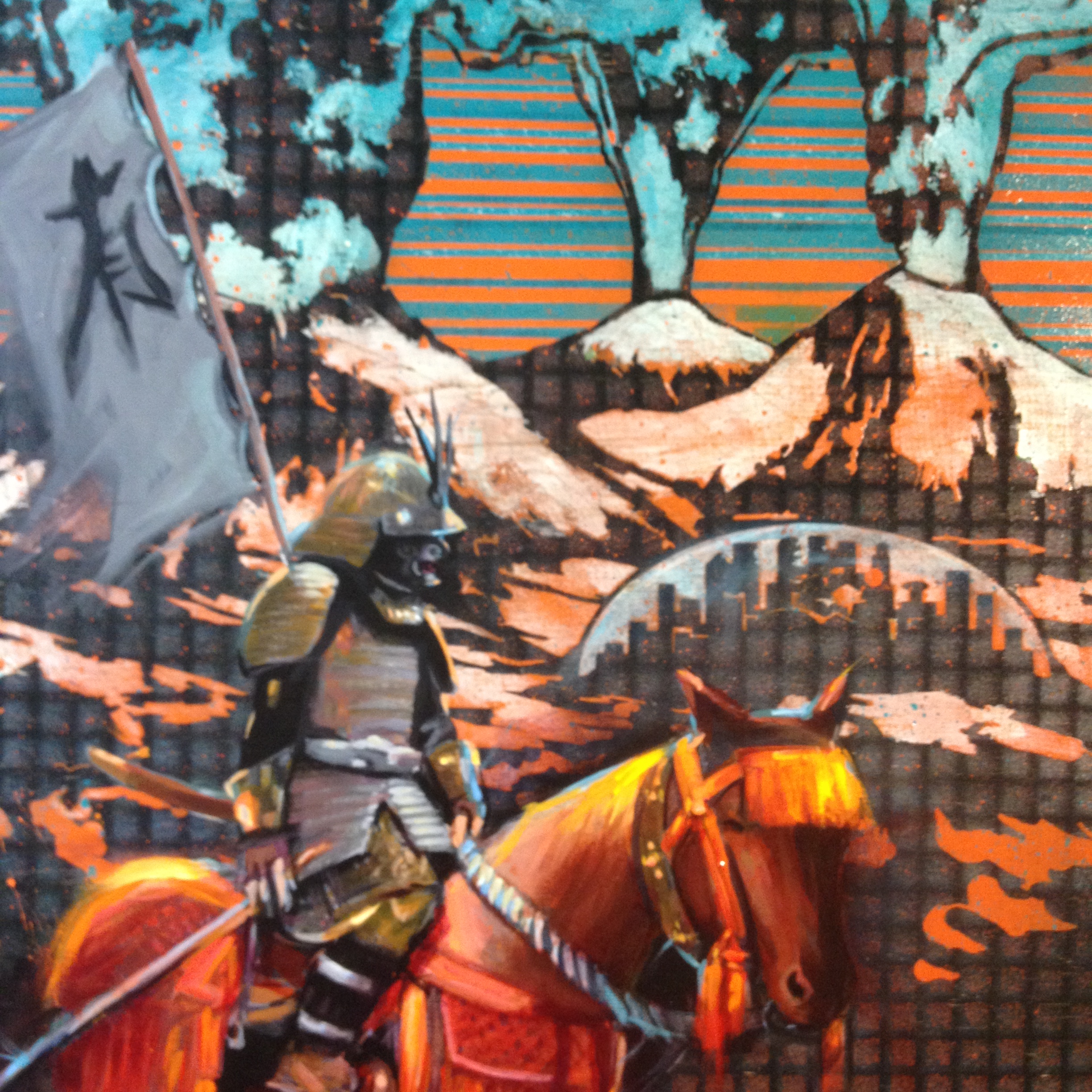 Detail, The Way, I like the painterly style on top of the graphic background. It’s good balance. It’s satisfying for me to see the same palette in two approaches.
I plan to add more collaborations to this series. There are other collaborations that are not part of this series and those will probably show up here at another time…
What’s Up With The Dome?
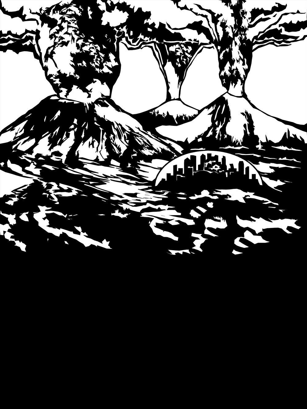
“Welcome To Cascadia” is what I call this series. I’ve mostly written about my process and painting technique, so I’ll talk a little about the imagery. There’s a loose narrative that is evolving, even if it’s surreal and aloof. When things are vague, we can imagine our own scenarios. (That’s not a cop out, I have my own ideas about the story but it’s still unfolding for me. There’s a lot of possible timelines for us.) The first image that I came up with was the three volcanos erupting; I’ve thought about that scene for a long time, in some form. Adding the First image of the domed city, in the Heron painting called “Seekers”, pushed the scenario into science fiction. I think the buildings look abandoned, like ruins. It’s fun to try for both futuristic and historical feel. Were the cities domed to protect us from the volcanoes? Did they not work? They are big cities, so the dome maybe worked for a long time….hmmm. It’s protection from the elements, but maybe not enough. Mother Nature is a bad ass.
 “Dome” 12×12 inches
 “The Bubble” 18×24
 “Blue Crane” 12×18 inches
Art Show At The Goodfoot (Portland, OR)
I have an exhibit at at The Goodfoot! The opening was super fun and the show looks great. Art will be on display for most of February. My paintings are hanging along side the work of Nathan Turner, Brett Bowers and Eric Buchman. There’s some nice overlap in style and technique. Check out the work here: http://thegoodfoot.com/gallery/
I feel pretty accomplished with my work for the month of January. I started out with seven pieces from a show in September. That was the beginning of this series, called “Welcome To Cascadia”. In October, I finished a collaboration that Natalie Oswald, started while we were working on our mural in Tacoma. (Check out the Mural video here: https://www.youtube.com/watch?v=gpXaaUTX6K4.) In January, I Built 20 panels and painted backgrounds; I finished 14 new pieces. I also carved and printed two editions of linocuts and hung a few of the Analog Owls. I even printed about 50 custom drink coasters for the evening. I’ll probably finish a few more Analog Owls to add to the show next week.
I’ll keep posting the images from this show; here’s a few from the first batch.
 “Seekers”, 24×36 inches, Acrylic
 “Hunter”, 24×36 inches, Acrylic
 “Migration”, 24×36 inches, acrylic (check out the purple iridescent in the reflection!)
 “Glow Koi”, 18×40 inches, acrylic. This is a collaboration with Natalie Oswald. We’ve done a lot of collaboration work over the years. You can see more of that here: http://natalieoswald.com/collab_picto.html. These collaborations are always influential to the way that I paint, both in approach and style.
Here’s a new version of the Koi that I made in January:
 “Alder Beetle”, 24×36 inches, acrylic
I’ve had a couple evenings at home, thanks to the snow in Portland. I’ve been taking a break from painting, to rest up and clean my house after the art bomb went off. I’ve been switching it up by doing some music related stuff, setting up my audio space and mixing a long dj set. I’ve also been doing some pinhole photography and carved a lino block for the Love Of Portland show. There’s a test print in my instagram feed. (below) I’ll post some links to prints for sale soon!
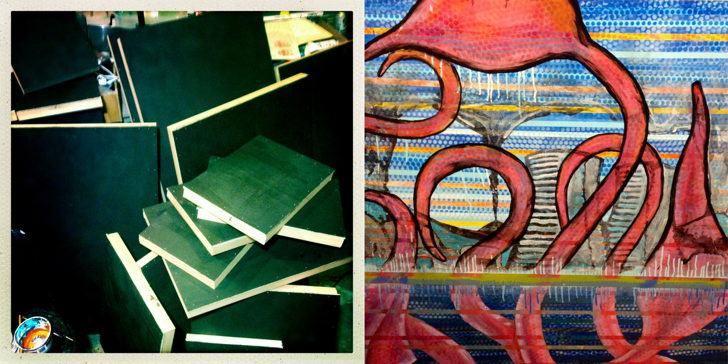
Sneak Peak – Tentacles (and WIP shots)
Friday. Finally, another full day for painting. I’m beginning to work out the final details on several pieces, have several mid-progress, and still a few to draw out (an elk, maybe). I’ll have three collaborative pieces in the show, and some block prints. Here’s a sneak peak at a couple new pieces. The shimmery effects don’t work much in photos, but a nice heavy clear coat will bring those out and the visual depth should be pretty cool. Sometimes all the layering pays off.
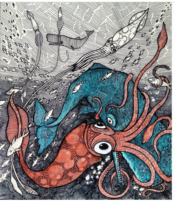
Pacific Octopus (detail, WIP)

WIP (work in porgress), I masked the finished octopi and started a new woodgrain pattern for the background.

Colossal Squid vs Sperm Whale (Detail, WIP)
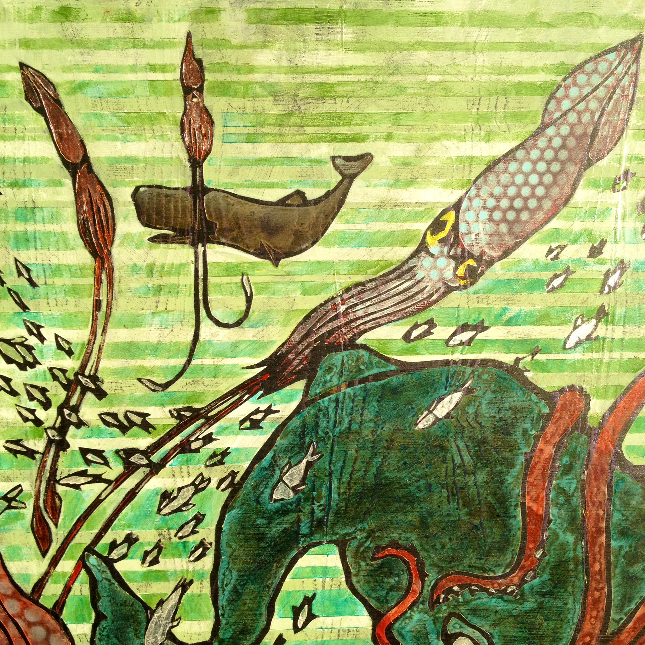
Work in Progress, whale textured:
WIP, some airbrush effect on the bigger whale. The yellow is the vinyl that is protecting the hard dark outline.
Just a few days left before the show. I’ll be finishing up several more new pieces this weekend. Also, posting more process shots in my instagram feed @artdamaged.
Art Studio progress (One Week to Goodfoot Show)
The last couple of days are a terrific blur. I’m in various stages of production, which you can see in the photo below. I’ve got finished backgrounds, a handful of completed pieces, some that are ready for collaboration, some that are masked and ready for paint. I took the photo in the day yesterday, then spent the night painting in squids, whales, and octopi.
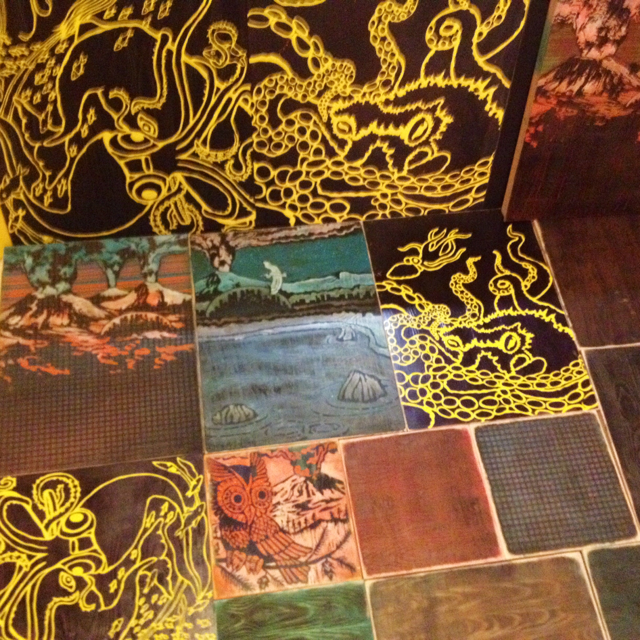
I’m posting progress shots as I go, via artdamaged instagram. (also, they may show up down at bottom of the page)
Squid Versus Whale
The whale always wins. They bomb down to the depths, while blasting the squid with sonar pulses. The whales know exactly where the squids are, and may have stunned them with sonar. (I’ve heard that getting sonared by a whale is like getting punched in the chest.) Recently, I’ve learned some cool facts about squid, thanks to documentary television and the internet. I assumed squid had suction cups, but didn’t realize that many varieties of squid have teeth around each sucker! I suppose that an exceptionally large squid might give the whale a fight, if it didn’t get chomped in the first attack. So, I drew a squid that’s almost as big as the whale. Another fact that I learned is that the Giant Squid has suckers and the Colossal Squid has two rows of HOOKS! That’s more like it.
A while back, I drew this with pen and a little acrylic wash of color. It was for the Monster Show.
On Friday, I drew this version with a Wacom tablet (digital drawing pen and tablet) in drawing software. The black line will be what I mask on the panel, so I can get crazy with the paint and pattern and still maintain a crisp illustrative edge. I added hooks and tried to make the squid more accurate in features. Both fighters were bulked up some and I tried to make the stare down a little more personal. I’ll be adding a horizon/shore line to the new piece.

Sunday Jan 19. Today is a big day. I have the whole day set aside for painting. On Friday, I cut a lot of stencils out of paint masking adhesive vinyl. I also drew some new images and created some variants of existing designs. Yesterday, I had only enough studio time to apply the masking to two panels, then I had to pack up for the People Of People’s art show; I was the vinyl selector for the evening. Afterward, I was feeling chilled and achy, and have developed a cough – damn, I do not want to finish a show with the flu, so I skipped the after party and a concert I was going to see and drank sinus tea and slept early after reading a little. Good job, responsible me. I think I’m feeling well enough to still make a good effort in the studio today.
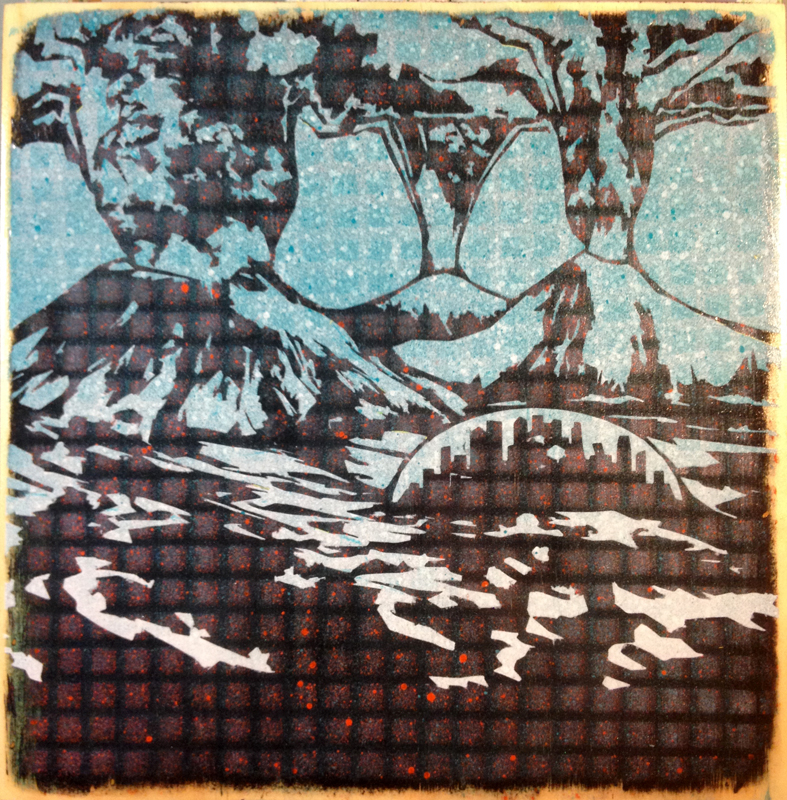
Also, Here’s a simple variant of the volcanos (I like this spelling better, both volcanos and volcanoes seem to be acceptable). I added the city dome and kept the foreground empty. I think It will show off one of the more successful patina-woodgrain backgrounds.
Art Show Progress (and Process) – Two Weeks To Go
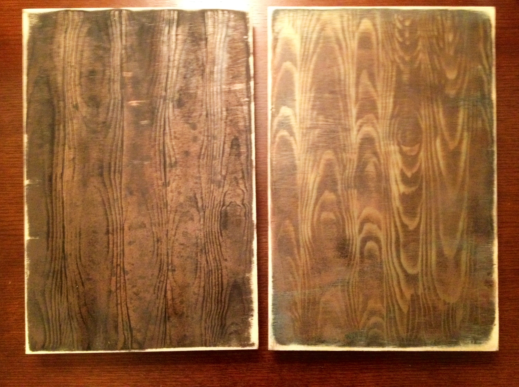
The last week has been productive, but things are getting fun now! I started out the new pieces by layering up the panels: black primer, sanding, more primer or glazes of color, sanding, then back and forth with layers of metallics for shimmer and color shift effects. The order of the layering really affects the way the iridescent pigments react to the light. (I don’t have any of the formulas memorized; I just know something cool is likely to happen and I stop when I’m excited about it.) All of the woodgrain is painted on. I have a faux finishing tool that makes it pretty easy; the woodgrain gets layered in once or twice in the process. Once I’m happy with it, I try to make it pretty level and smooth, so it masks cleanly. This is the background layer.
For most of the images, I want this background to work as the “black” outline; why not make black complex and interesting. The aesthetic that I’m drawn to for this is sort of weathered patina with greenish and bronze or copper that’s stained and scuffed up.
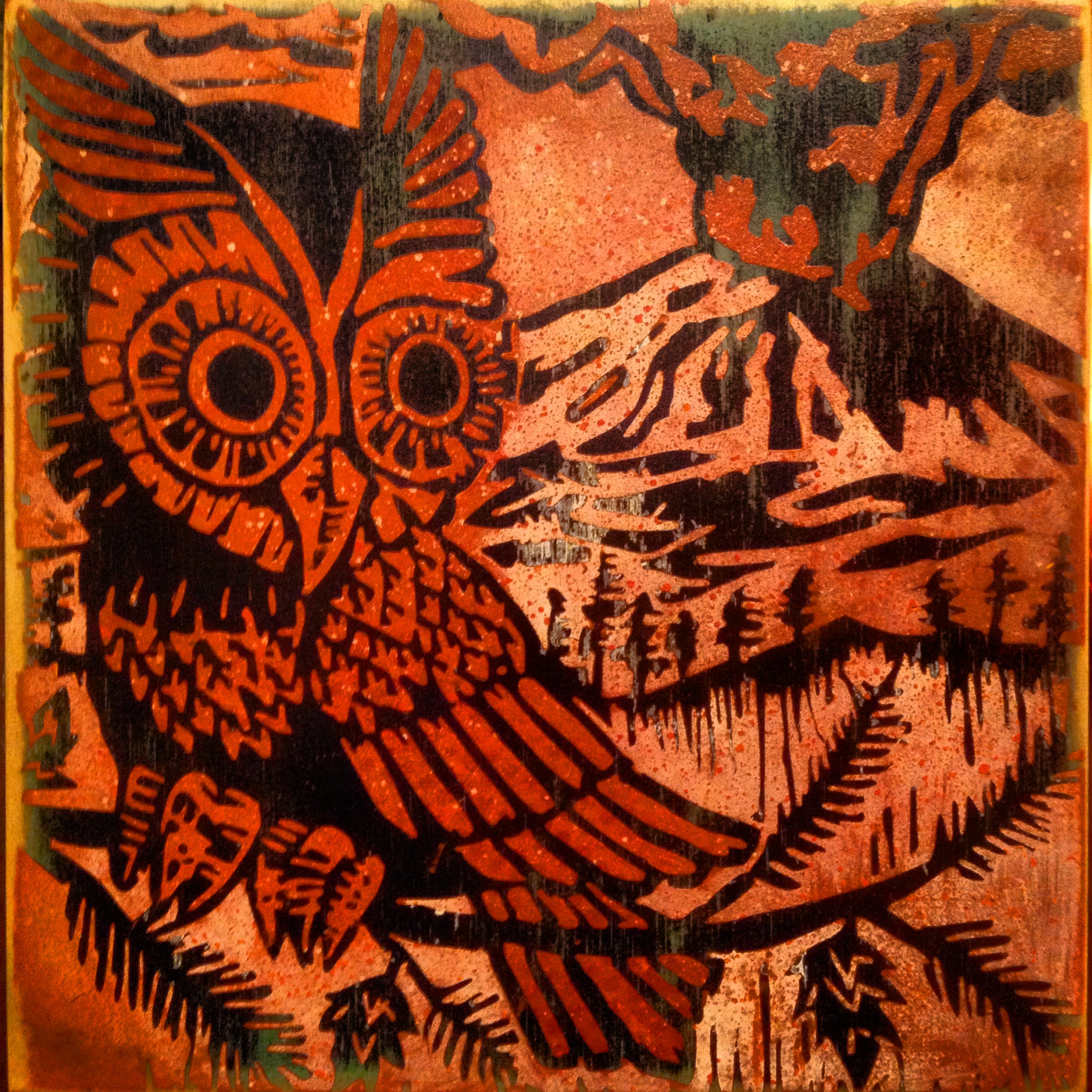
Once most of my panels were layered up, I was excited to do some illustration on top, so I painted an owl with a volcano. I enjoy making variants, versions, whatever. Themes/Motifs/Series within series. I like to try all the options; I used to get stuck trying to decide the best way to finish a piece. Now I like to see them all in context and appreciate how they relate to one another. Repetition adds a weird twist to how we think about the pieces too: how original is it? Is the print on wood have value over a print on paper? We think of prints as copies sometimes. When it’s painted, is that a print or a painting? — Yeah, this is the stuff that I think about during those hours of brushing layers and sanding; it’s very contemplative and zen. Haha! (for real tho.)
This is the newest one. It’s a little guy. 12×12 inches. Acrylic on wood panel.
I cut the stencil after working the image up in photoshop, from this photo of an 8×8 print:

I printed it from this block that I carved:

I sketched the block out, while looking at this painting:
I used the 8×8 block to print 6 pieces for the Big 400 Art Show. They looked like this:

There’s some bigger versions with a similar composition, one with mt. hood, one with multiple volcanoes. I’ll share those another time.
I’ve also drawn up two new compositions and I’m working on the stencils tonight. I’ll share designs and progress tomorrow. I expect to have illustrative images going down onto the bottom layers over the weekend! My schedule has been working in the early afternoon (day job) and then napping for about three hours, then studio arting from about ten until late (bed around 5 or 6am) then about five hours of sleep for the night. It’s working alright; tho, I think I prefer to get started in the afternoon so I’m in a groove by night time.
My new images are squids and octopi…More tomorrow!
Owl Art
Ha ha! I’m laughing to myself, wondering if that title will get google hits. I know that owls are a hot item these days; I like to say that the most hipster image would be an owl with antlers and an old timey mustache. Fads come and go but some things will always be cool to me: robots, dinosaurs, plaid flannel shirts, hot rods and owls (those come to mind easily…).
When my mother was a girl, my grandfather (we called him pa-pa, but in the Carolinas that’s “paw paw” with extra twang on the second one but I can’t figure out how to spell it phonetically) was driving home (I picture his patina green 70ish Ford pickup) and a Great Horned Owl flew into the side of his truck, broke it’s neck and died. Pa-pa brought it home and my Mom was able to get a close look and has loved owls since. The poor owl dude was taken to the York County Nature Museum in Rock Hill, South Carolina. I’d like to think it’s still the same owl on display.
Mom got lots of owl presents and when people brought souvenirs back for her they were owls. We can all relate to this right? (There was a time when I got dinosaurs, smiley faces, aliens, animaniacs– and that was just since college, haha!) I guess the trick is to not become disenchanted with imagery that makes us happy, but to be choosy about the quality of the items and imagery we surround ourselves with.
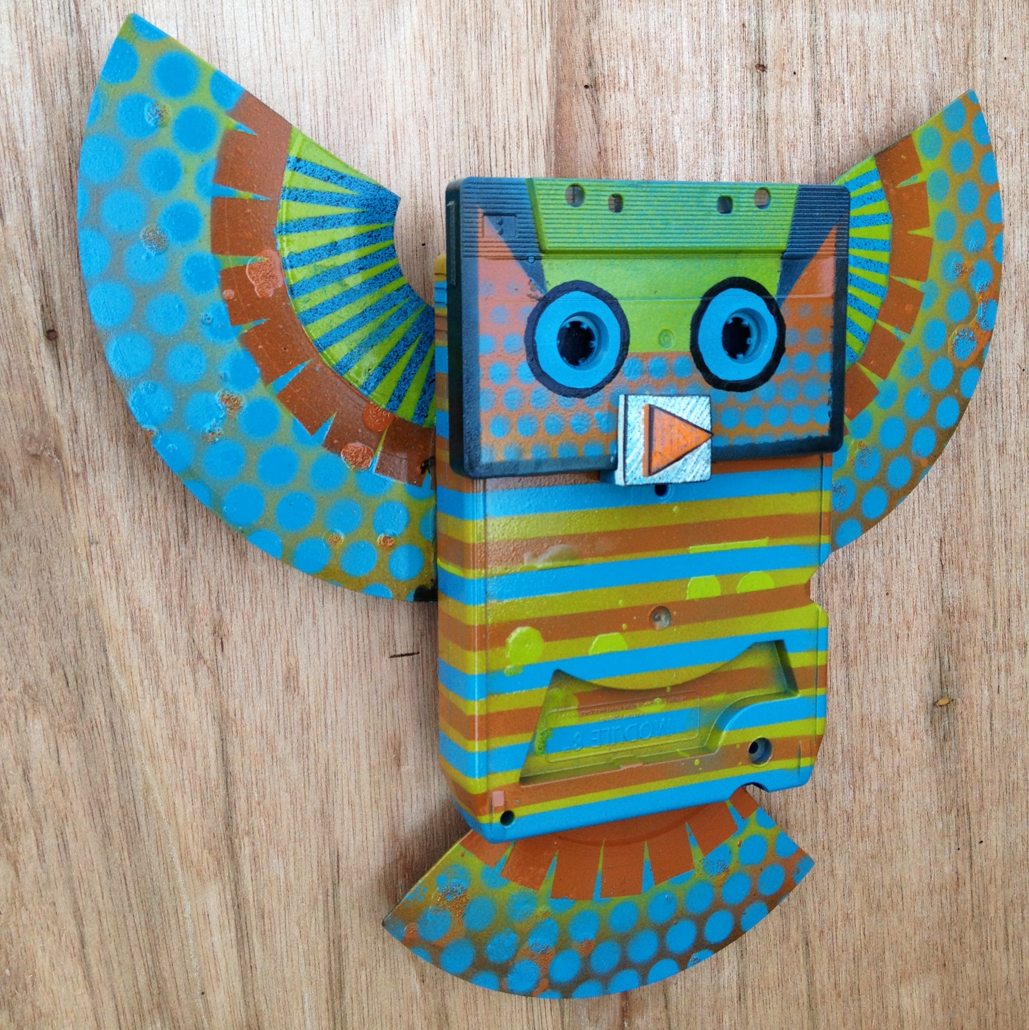
I’ve always thought of owls as mom’s thing. I never really drew or painted them. They’re not easy to capture (in likeness, but probably they are sneaky in the wild too.). Their shape is amorphous and their feathers tend to be tree bark camouflage which is like painting bark and moss texture…also, I think, is challenging. So, I tend to focus on the stylized parts like swoopy feathers and extreme eyes and beak, also the shape of the larger feathers. That’s what I’ve done with this most recent batch. My only other owl art has been even more stylized or even cartoonish (like the 3D owls made out of 8-Track, Cassette, and 7″ records).
Owls became my thing when I realized that it’s my totem animal. Like i said, I always thought it was mom’s thing but then I just kept seeing them(sometimes in unlikely places) at significant moments.They’ve sat in trees near me or swooped me and screeched, glided by at eye level and turned to look at me under a full moon – usually when I’m having an epiphany of sorts. This makes sense in nature; however, it’s happened in cities too. A Great Horned Owl swooped down and screeched when I was in East Los Angeles.
So, yeah. Owls are rad. Embrace the things that you love, that make you feel good, and don’t sweat the cheesy impostors that come and go in waves of pop culture.
Here’s a few owls:
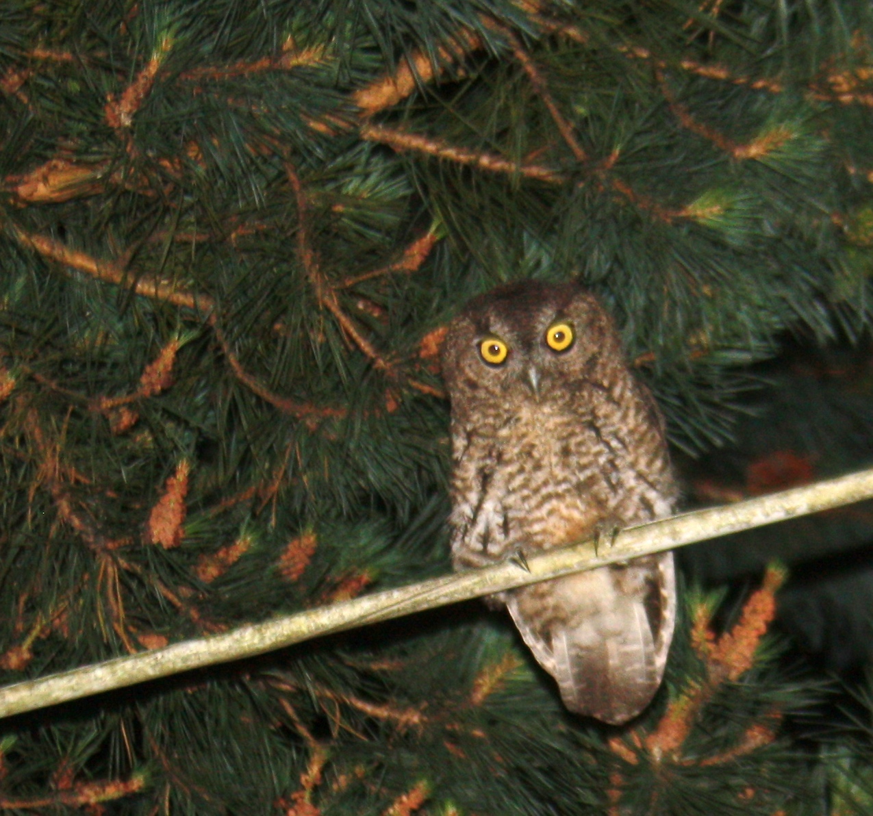
I used this photo to paint my piece for “The Bird Show”. He and his buddies were out in the yard at the last house I lived in. I can hear them in my neighborhood now but haven’t seen them. Here’s the painting:
The 8-track owls (Analog Owls) look like this:
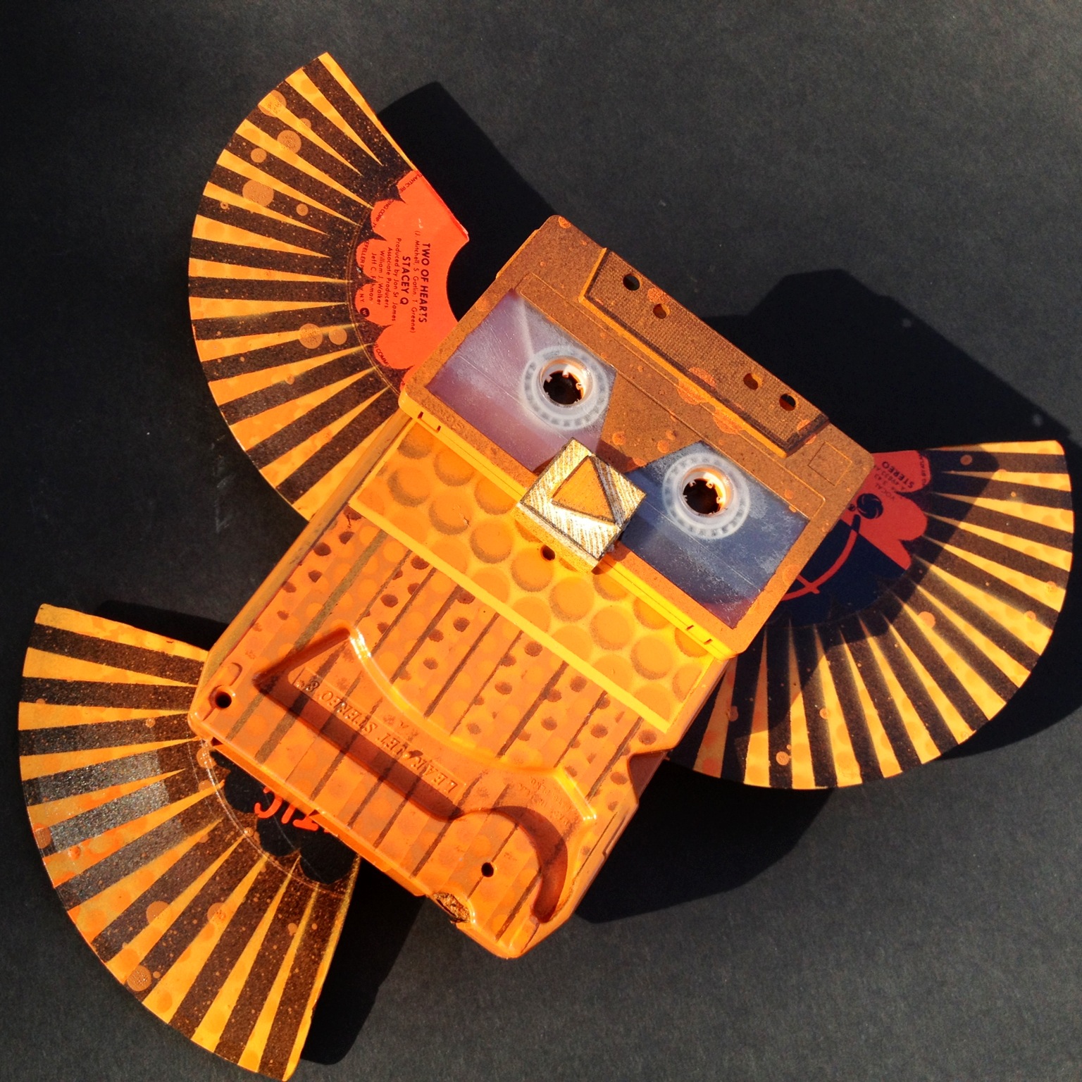
I’ll have some of these for sale at the art show on the 30th of January at The Goodfoot in Portland.
I’m going to talk about my art show progress tomorrow. I want to share more owl photos, so I’ll share the ones related to my show. I’m excited with my new imagery and I’m going now to finish drawing a squid fighting a sperm whale!
The owl at the top, is one of my pieces for the first Big 100 show.
Volcanoes! (Boom For Real)
I remember the day that Mt. Saint Helens erupted. The big one, on May 18th, 1980. I have a photo album of newspaper clippings and a small canister of volcanic ash. It was a big deal for me as a kid. I didn’t make a specific decision to paint volcanoes, but somehow it keeps happening. (why doesn’t spell check catch “volcanos”? I really want to spell it without the e.)
This digital drawing was the springboard for this recent series:
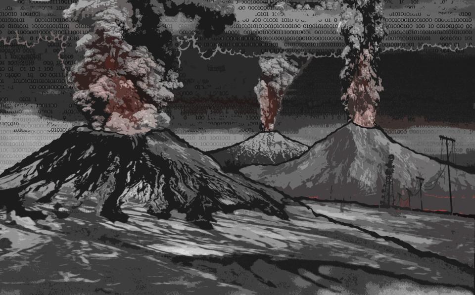
I grew up in the cold war, but never really worried too much about the Russians bombing us. I have friends that had “day after” type dreams fairly often. Me, not so much. I had a fair grasp of Mutually Assured Destruction. In recent decades, I’ve had a fair amount of dreams where volcanoes are erupting, including some flooding, landslides and Pompei-esque ash fallout. I don’t consider them nightmares though. Not so much scary, as intense. It’s a reality it the Pacific Northwest (and all of the Pacific Rim). Before we were here and long after…
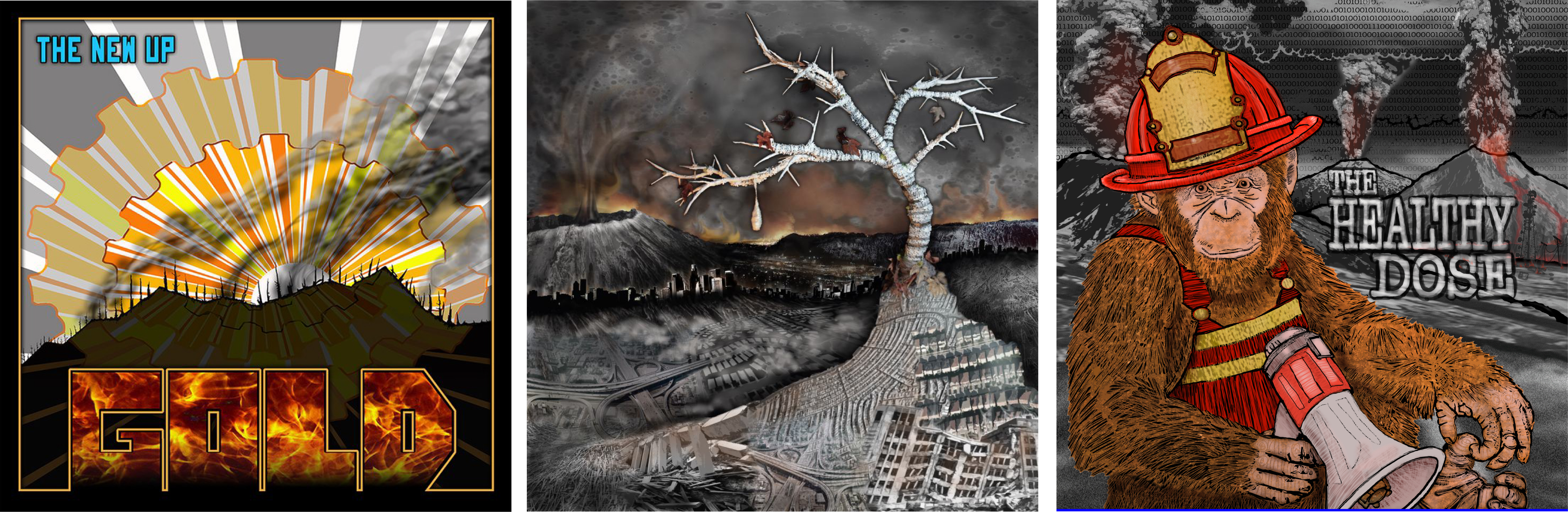
Over the last few years, I’ve done some album art for bands that I know and love. The requests for imagery weren’t specific in every case; however, some sort of volcano was the final result for these three! The image of the Cascade Range going off is something that I’ve been thinking about for some time, and that was part of The Health Dose back cover (and cropped for the front, below right). Mt. Saint Helens worked her way into the Fulero//Lehe cover (below middle, “Cocoon”). For The New Up “Gold” (below left), it was maybe a crater, but could also be a volcano.
Once again, I’ll mention that each piece in my new series has at least one volcano in it. I’m not sure how long that will be necessary, but for now, I like it (and the reference to “views of Mt. Fuji”). There’s somewhat of a narrative that is evolving around it, but I’m not ready to get into that. 😉 So far, I’ve represented Mt. Hood, Mt. St. Helens and Mt. Bachelor. I think I’ll add a few more locals. Maybe Adams and Rainier.
So, Here’s my work progress:
Jan 10: Today, I shopped for vinyl masking film and some cool spray paint colors. I worked the ol day job. I went by the goodwill and did some treasure hunting (I’ve been learning to fly my new remote control gyrocopter. Score!!). I gessoed up some black on 20 panels and painted outlines and a background on a giant squid painting. (both the squid and the painting are giant…) It was a studio session night with the homies, painting and eating snacks.
Coming up: Owls…
The Influence of Printmaking (on my artwork)
In college, I was a printmaker. I carved woodblocks, etched copper plates, printed from linoleum and lithograph stones, and pulled silkscreen prints. In the last decade, I’ve mostly been a painter; although, printmaking still affects my technique. Much of the masking work that I do with tape or vinyl film is derived from a reduction printmaking process. (Glossary: “Reduction” – With a reduction print, each color is created from the same block. Each color is printed, the block is carved with more detail, inked again and then the new color is printed on top of the previous – usually on paper. The entire edition must be printed at once, because the block is permanently changed with each color. A truly “Limited Edition”.)
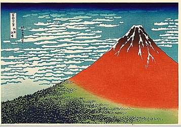
HOKUSAI http://en.wikipedia.org/wiki/Hokusai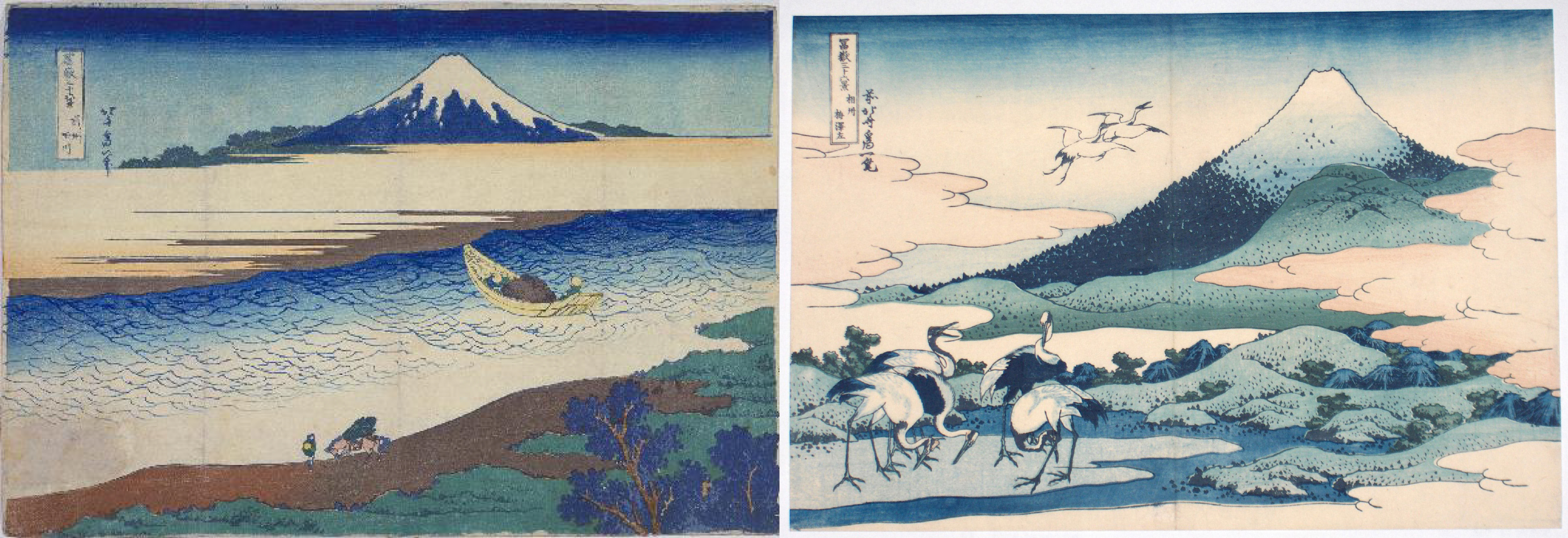
In addition to techniques, I’m drawn to the idea of editions, multiples, and variations (which are all concepts that are part of printmaking). Katsushika Hokusai is an artist that, for me, exemplifies the concept of exploring a theme. Having one thing that ties together a series, a springboard for experimentation, helps me narrow down the possibilities when deciding on imagery. The images above are from Hokusai’s “36 views of Mt. Fuji”. He also published “100 Views of Mt. Fuji”. I’ve repeated imagery in paintings because I like the context of using different colors, media, pattern on the same composition because it gives me a reference point for the subtleties, or even effectiveness, of each.
You’ll probably notice the influence of the Hokusai graphic print style, in my paintings. Also, once I realized that I had started several paintings with volcanoes in them – which reminded me of the Mt. Fuji series – I decided that I would include volcanoes in each pieces. I like the Mt. Fuji reference. I should probably write about volcanoes next…
Progress:
Jan 6: I spent the day cleaning up the stencil design for my commission, then cutting the vinyl mask, and painted into the wee hours. I met with Johnny Luczycki, to discuss ideas about collaboration images and process/style.
Jan 7: I worked my day job. I shopped for Gesso (Glossary: “Gesso” is a painting primer that will prep nearly any surface for painting. It seals the surface and contains some grit that helps give “tooth” to the surface to help the paint adhere.) and tried to locate some soft block printing material in larger sheets. I didn’t find what I needed. Worked my night job.
Jan 8: Worked my day job. Bought some black gesso since I’ll be starting out with dark colors, this will make it easy to cover. I napped. I painted some panels with gesso. I’ll need a few coats, plus sanding between coats to get the surface smooth.
Jan 9: Tired. Slept late. I’m going to gesso the rest of the panels tonight. Make a shopping list for tomorrow. I need some things before the weekend!
Next…What’s up with the volcanoes? maybe actual art images from this series…
Progress/Process (January Art Show) Day 5
I’ve learned that one of the best ways to get inspired to start painting is to prepare the support. (Glossary: “Support” – I like this generic term for the substrate that will be painted on. It can be a stretched canvas, panel, paper, found item, etc.) Building and priming the supports is a great way to get into the studio or workshop and get hands on; it’s a great way to brainstorm and think about sizes and composition while completing necessary prep work.
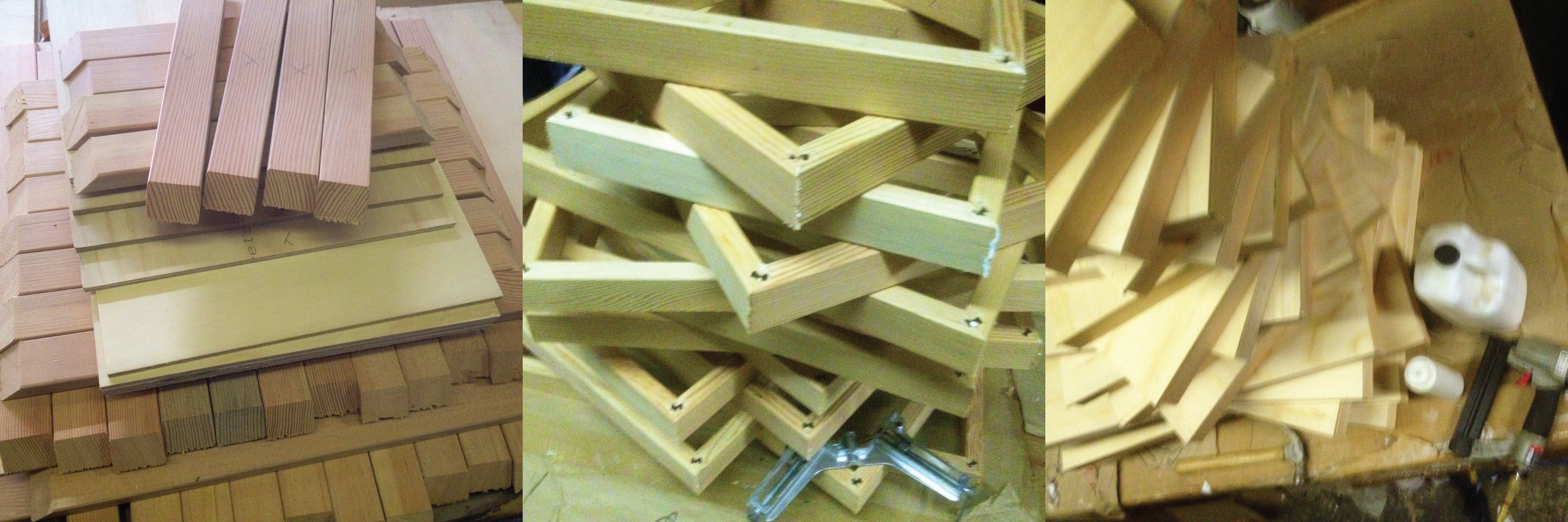
Most recently, I’ve been working on wooden panels. It’s rigid and great for masking, stenciling, and cutting directly on the surface. I can really work the surface, sand, distress, scratch, etc. without stretching or ripping that might happen on a canvas. I like the simple presentation of a cradled plywood panel. (Glossary: “Cradled” – a simple frame creates depth to the sides and strength to the support. The panel is attached to the front of the frame so the painting surface extends edge-to-edge.)
Materials: I’ve been using Luan Mahogany plywood for a few years. It’s lighter, stronger and not much more expensive than masonite. It wont swell from moisture like masonite (pressed saw dust panels). The appearance of the mahogany surface can be really striking and stains nicely. I like to take advantage of the woodgrain. The first pieces in this newest series presented a few challenges because of al the sanding that I did, trying to get a super smooth surface. The top veneer of Luan is thin and porous and sanding made it reee-eally thin at times. I had issues with the veneer lifting/tearing off when I pulled the adhesive mask that I use for stenciling. This round, I’m trying new wood products. I chose a thicker pine plywood with only three layers that are fairly thick; also, I am using a very straight grained fir for the sides to prevent warping. The materials were more than twice as much, but still very affordable because I’m building them myself.
I had the plywood cut to size when I bought it. I cut down all of the sides on a miter cutter, prior to assembly. Using sizes that share one dimension, made production simple (36×24. 24×18, 18×12, 12×12). Also, very little waste. The entire sheet of plywood was used. Next, I routed, glued and pinned the corners like a picture frame. Once all of the frames were assembled, I glued the top of the frame and set the panel on top, lined it up and nailed it on (with an air powered brad gun). I’m priming the surface on these so I’ll be filling the nail holes. Glue and clamps would work if I didn’t want nail holes to show on a natural woodgrain surface.
Progress:
Jan 3: I purchased lumber. I worked my day job. I read a book. (I’ve avoided the uber-distraction of internet TV so far, this month.)
Jan 4: I cut down frames for cradled sides. I drove to the Pearl District and picked paintings up from a show, ate chinese food, drove home and napped. I went back to the shop and assembled panels. I worked night job.
Jan 5. I’ve slept most of the day (remember, night job…) and played some drums. Now I have some design work to do for a commissioned painting that needs attention.
Coming up: illustration techniques, more materials, thematic ideas…probably more napping.
