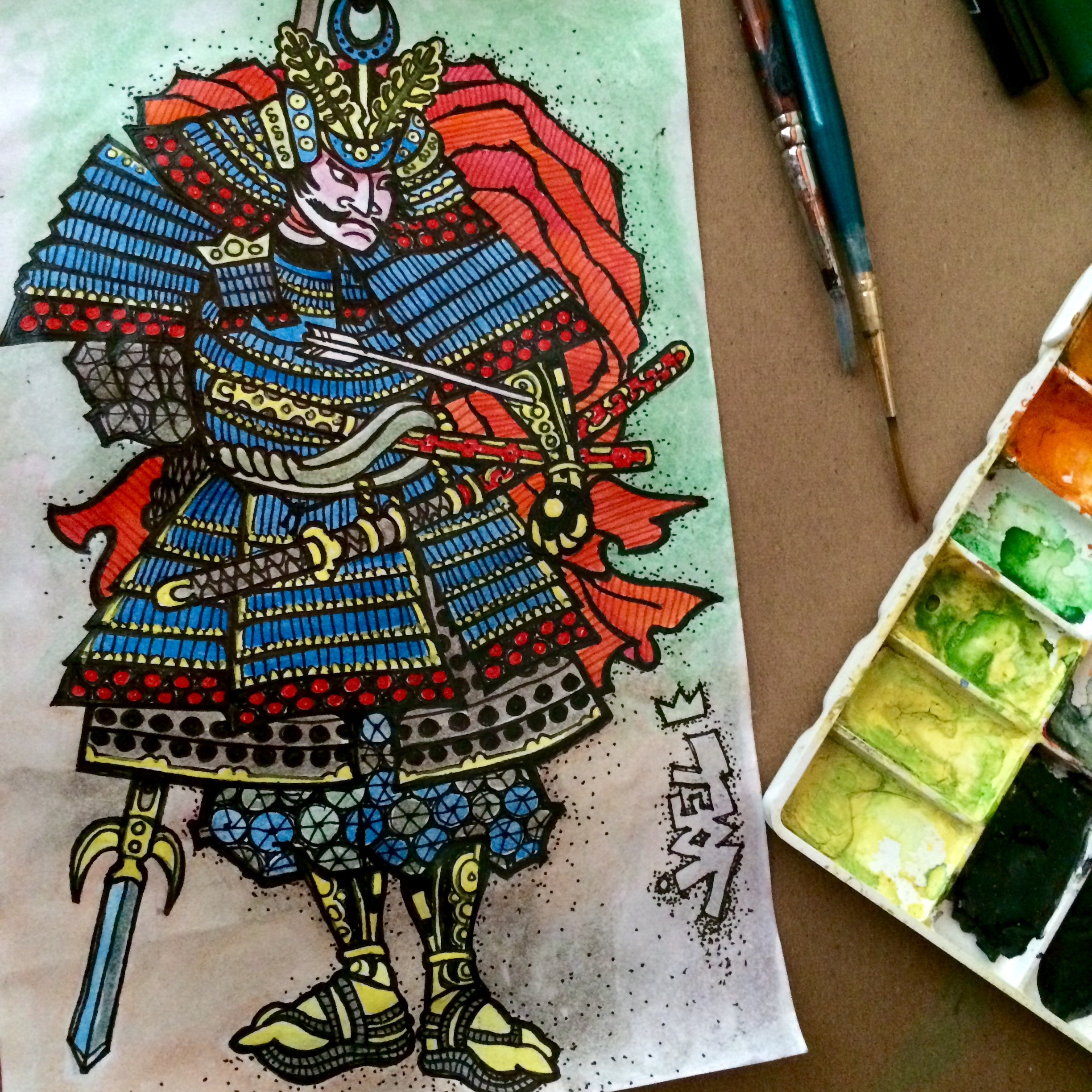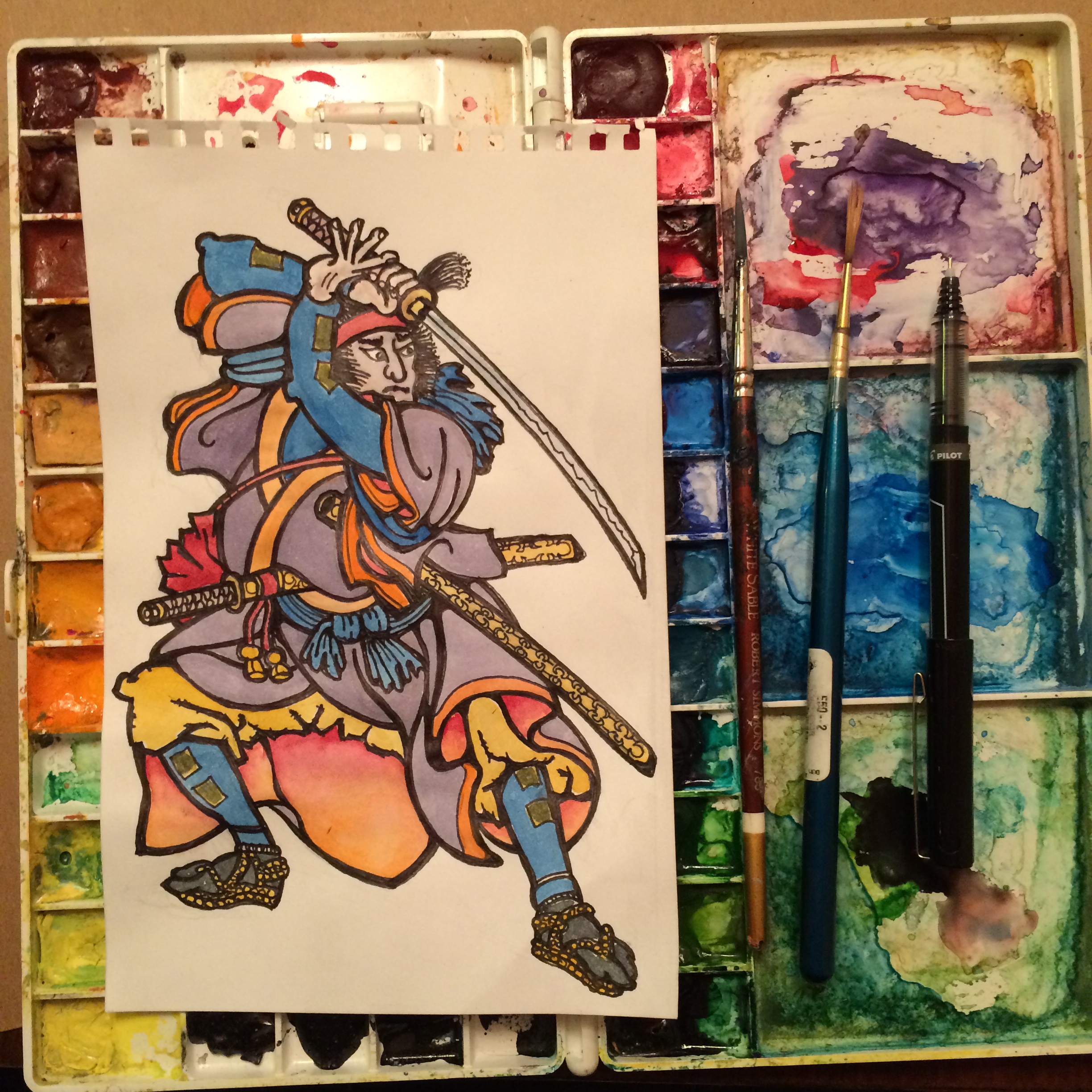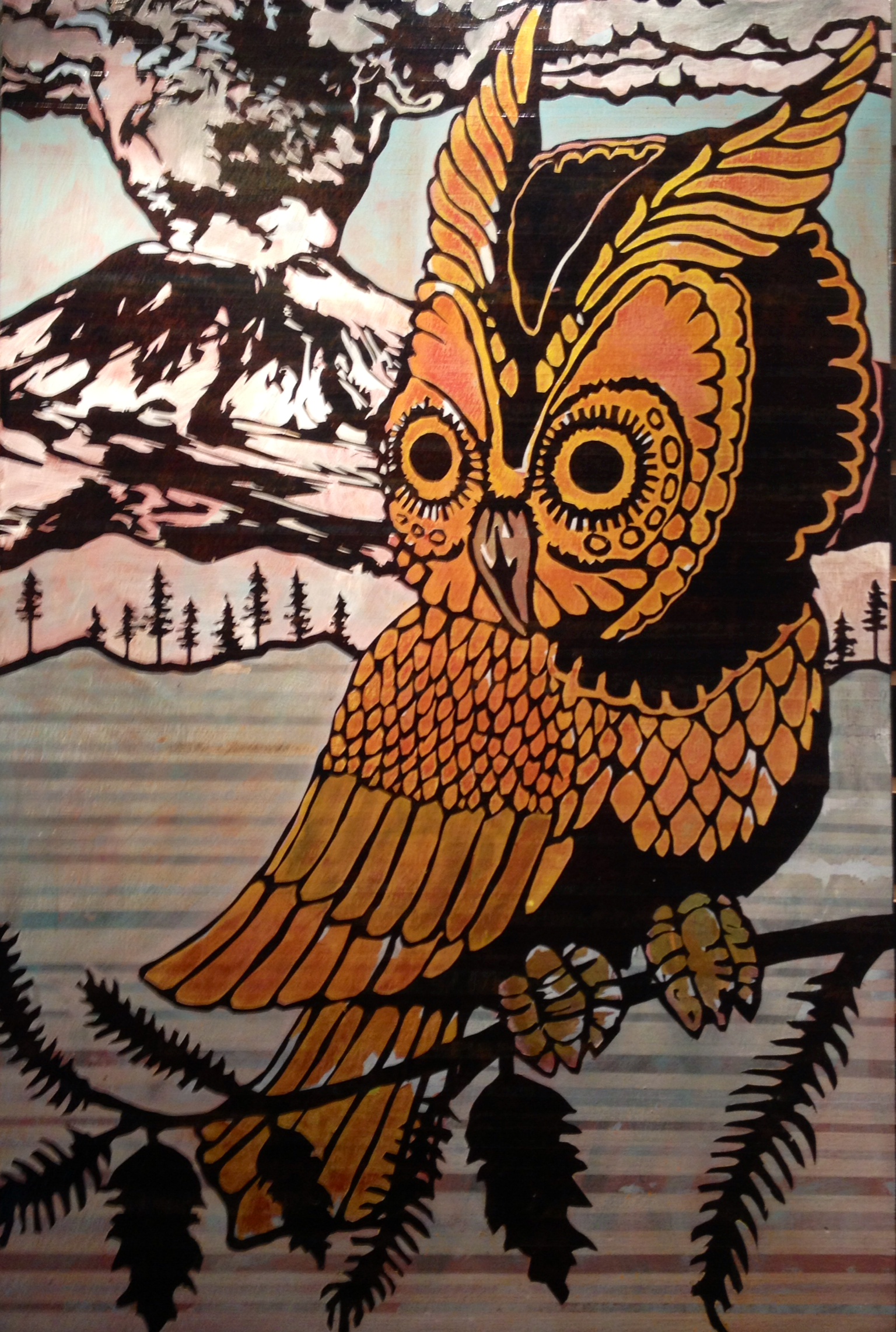
We all just do the best with the tools and resources that we have. It’s nice to have a plan and there’s usually adjustments to be made. I’ve always wanted the bumper sticker that says “Plan on improvising”. I do a lot of planning before the paint hits the panel; then I’m just winging it, really. I enjoy all of the different elements involved and the layering can be a memory exercise. I’m going to share some of my steps here, because it’s not always easy to explain verbally. The final painting is 100% acrylic paint on mahogany plywood panel. My techniques are influenced by reduction woodblock printing, silkscreen printing, and stenciling (but with adhesive similar to airbrush frisket masking film).
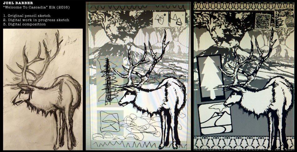
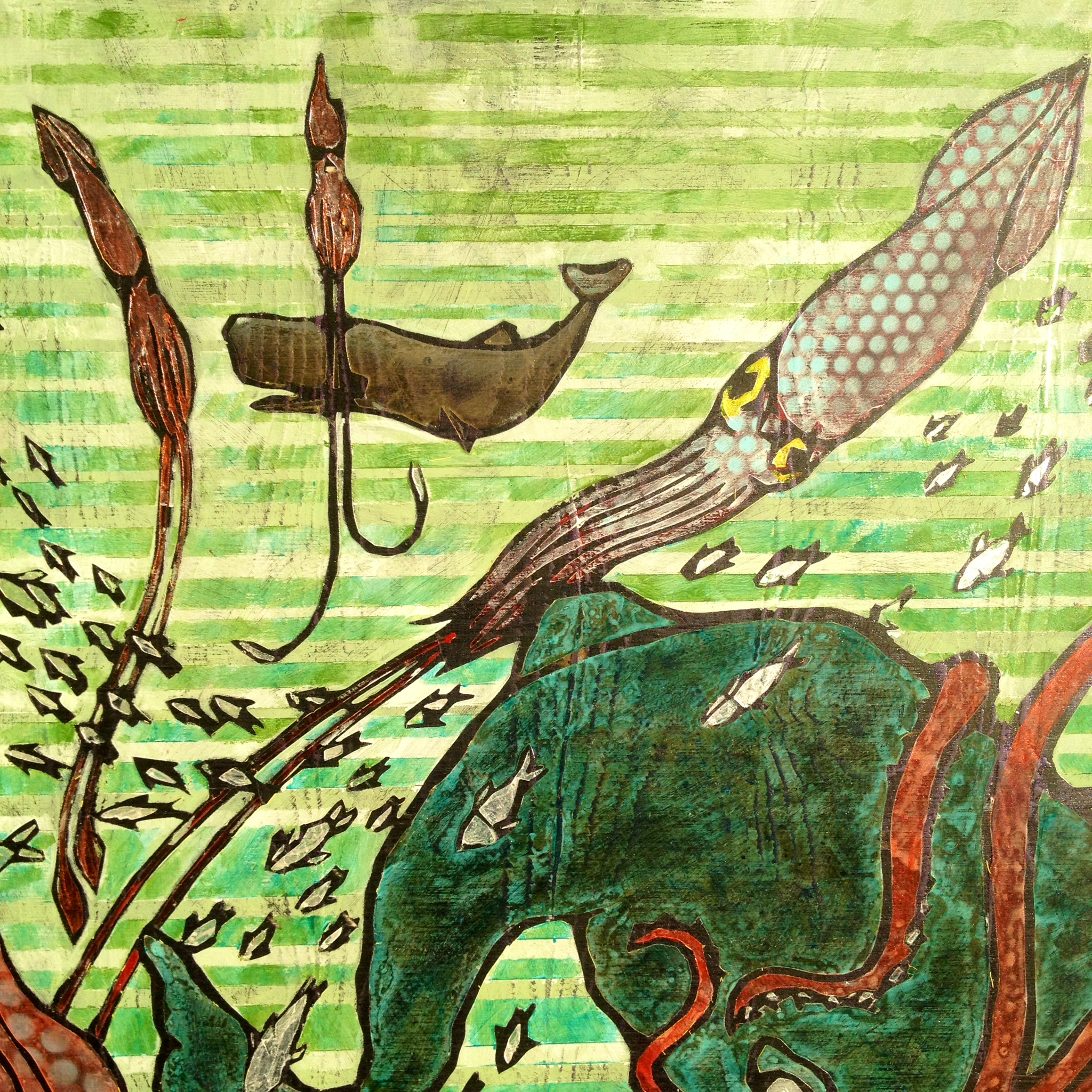
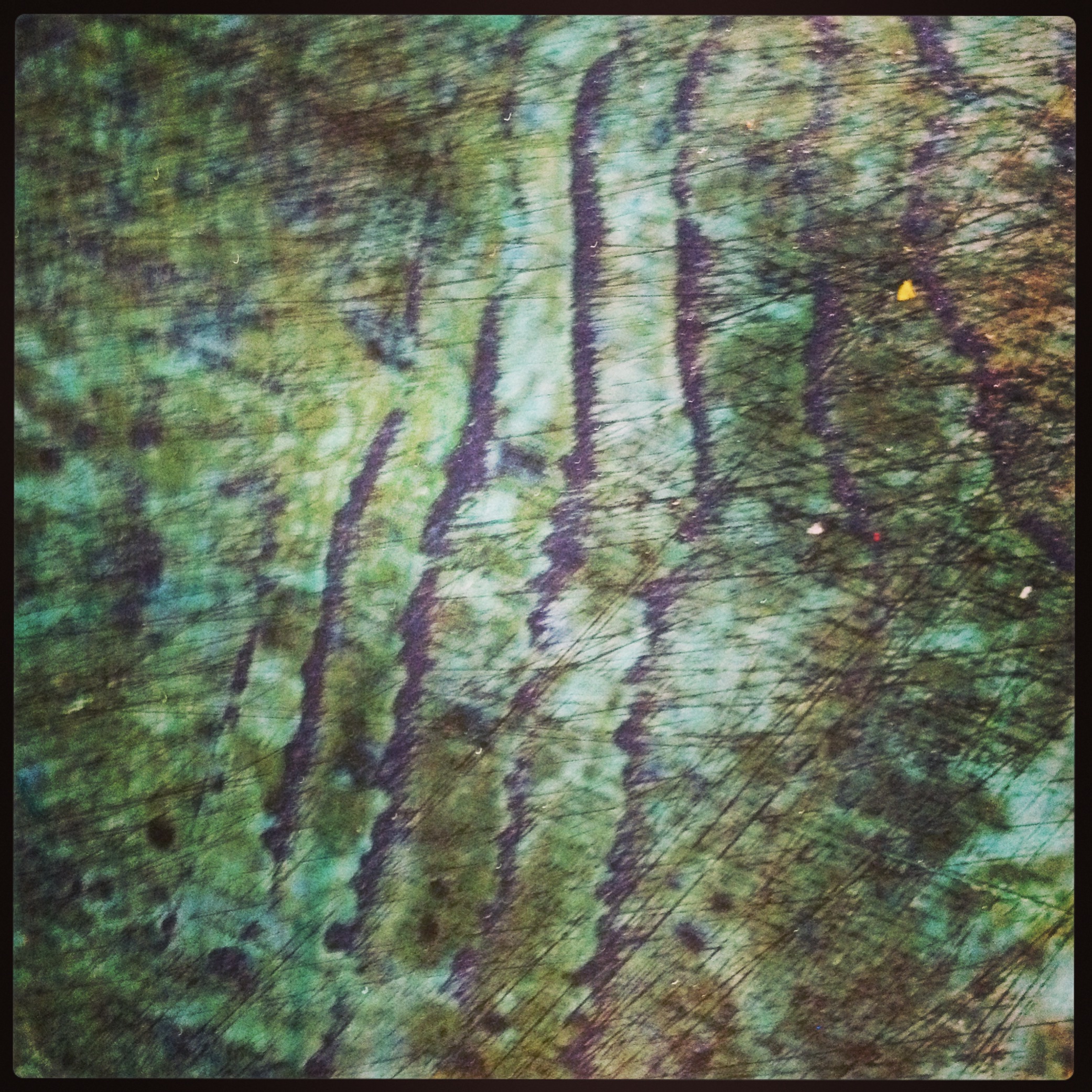
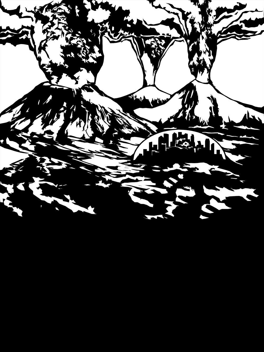
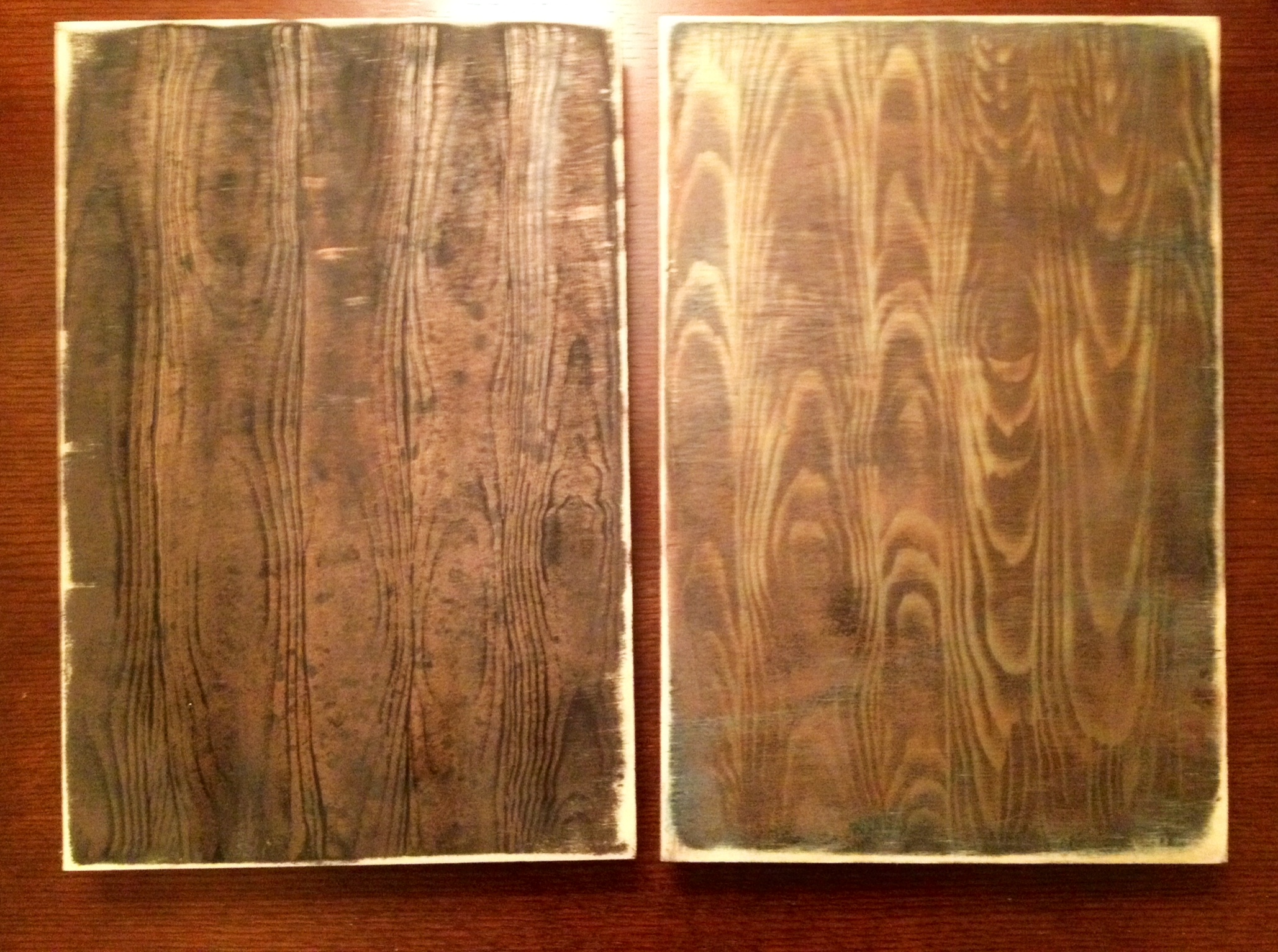
Once I’m happy with my composition, I decide which elements will need to be painted first. I finalize the drawing then cut the stencil out of adhesive vinyl sheets, using a computer driven cutter/plotter machine. I like to call this my “robot intern”. Stencil proportions usually change so I cut and apply the masking as I go (not all before I start). I use acrylic artist spray paint, acrylic liquid paint and some acrylic medium. I start with a general color scheme idea and choose pattern, visual texture, color combinations along the way. In the middle image above, you can see that I was going to draw city domes in the distance and mimic that with rock cairns up close; however, I decided that would be too busy once the pattern was down. Maybe that would be a good version if I skip the signs up front…Here’s some process shots below. Masking the elk after striping it up, the second layer of tree/volcano border stencils lined up and applied, and workspace on the panel just after pulling paint to make the woodgrain on the signs.

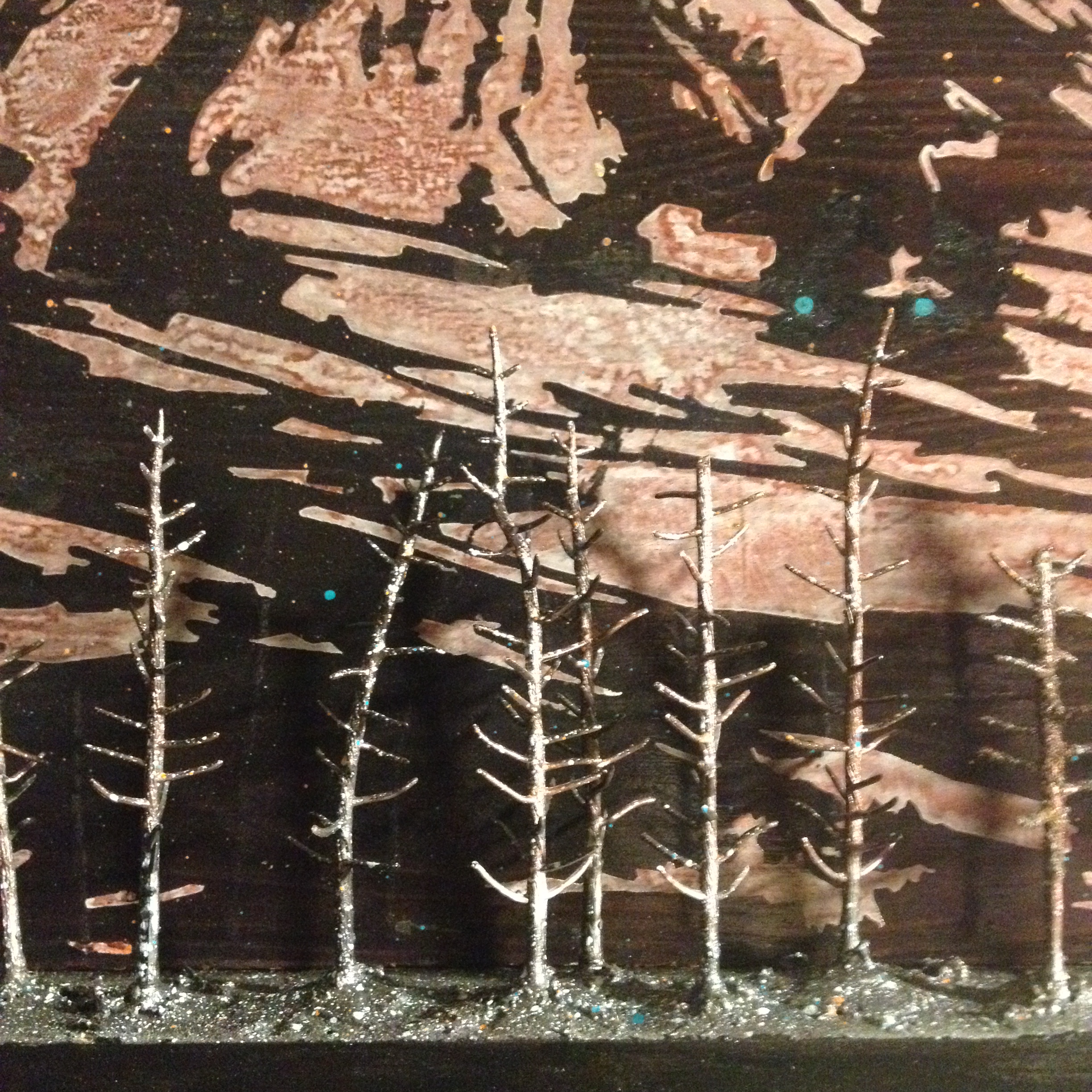
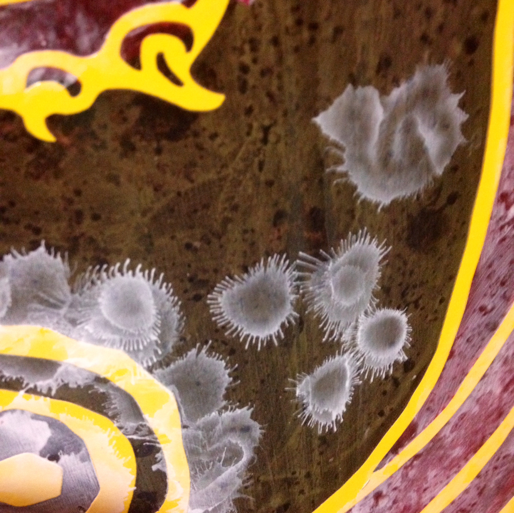
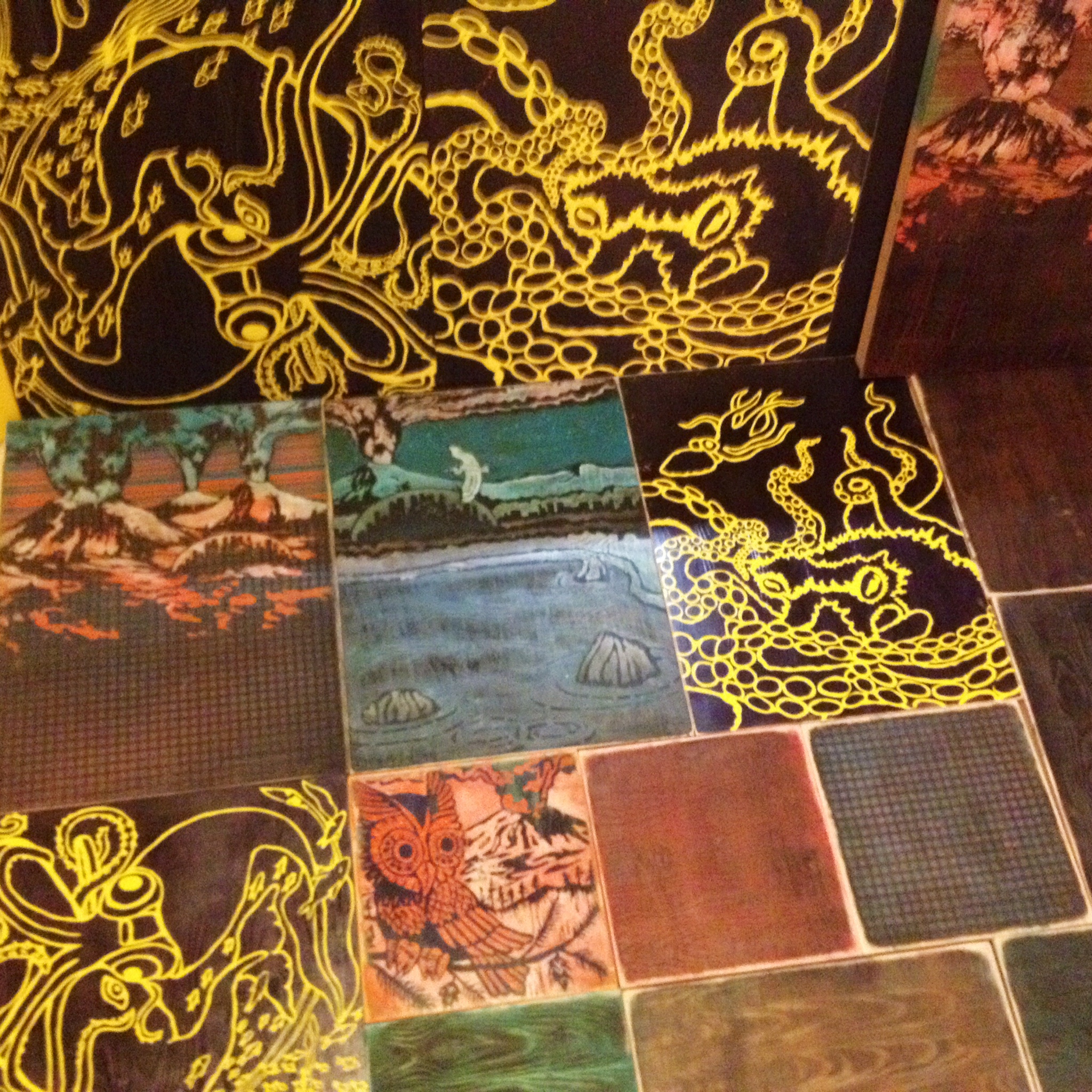
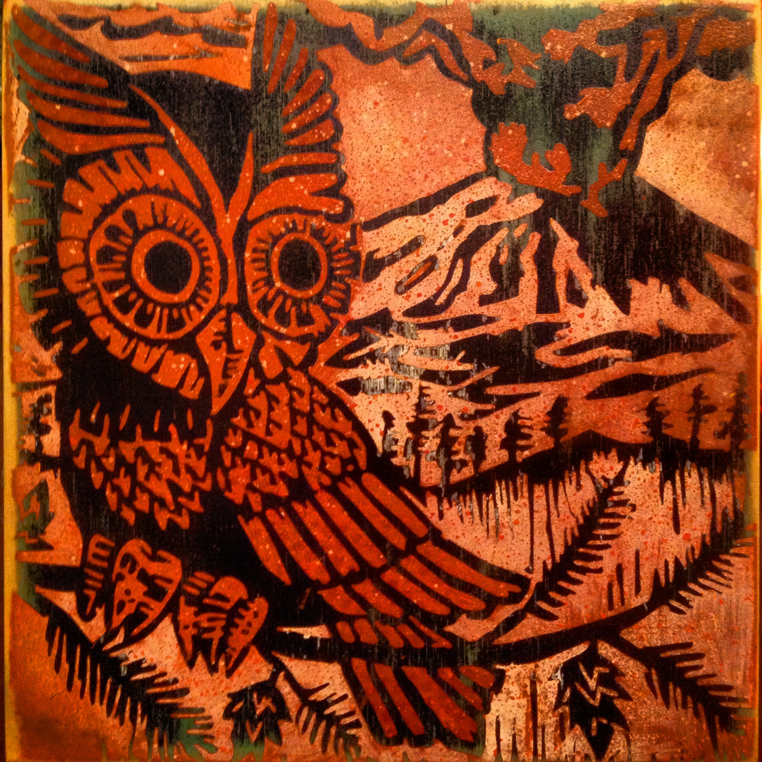
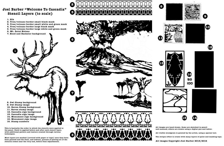
Below, I’ve created an exploded view of sorts in order to share all of the masking layers that were applied to the panel. There’s a lot of painting and mess making before and after each layer is applied. At the end, I peel all of the stencils up. That was really tedious with this piece because there were so many layers of paint that the vinyl came off in small bits. It’s still exciting to reveal the (almost) final product. Once I removed all of the tape and masking vinyl, I glazed in some transparent white in the sky and ash clouds and gave the stamps a postage value. After some gentle washing and sanding, a nice glossy clear coat helps create some visual depth in the patterns and boosts the contrast of the texture. ~ JB
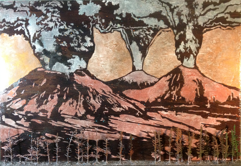
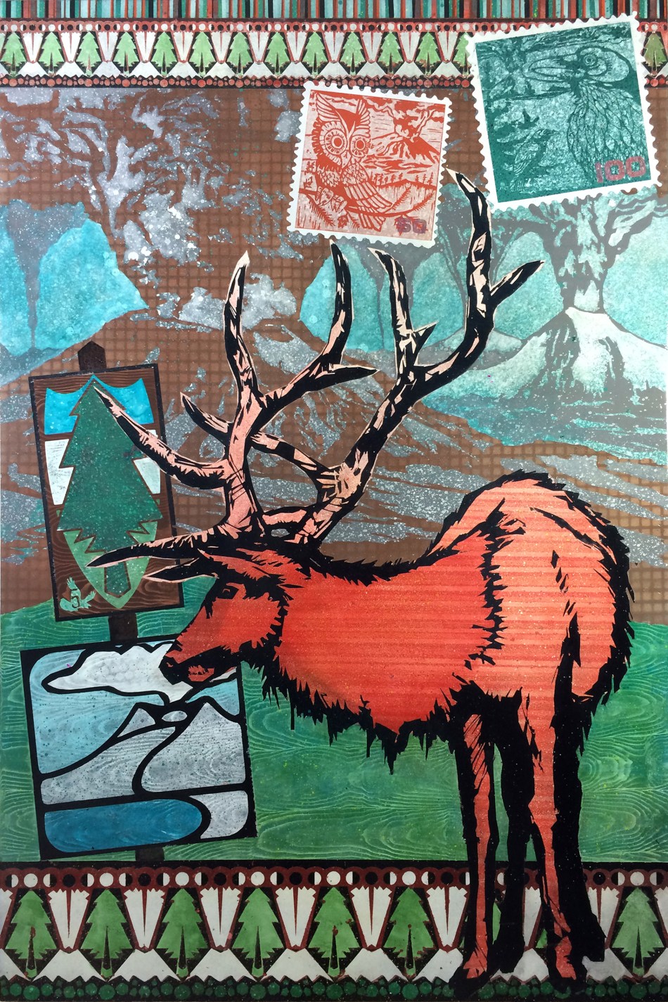
Here’s how this turned out. It’s 32″ x 48″. I’m going for something like an old National Park poster or post-card (obviously, stamps) and the border reminds me of a hiking sweater or wool blanket design. The volcano sign is based on the National Volcanic Monument signs, and the top sign is meant to look like a trail marker (with reference to the flag of Cascadia and the Interstate-5 badge).
If you would like to see this in person (or bring in home with you!), visit my show at The Gallery At The Jupiter Hotel in Portland, thru March.