Happy 2015 To you, Happy Birthday To Me!

Without checking, I’m pretty sure that the last time I was here typing was a year ago, when I had a show at The Goodfoot. I wrote entries throughout my process of painting for that show. I’m here again, because it’s that time. Thursday Feb 26 is the opening for a 4 artist group show and I will be one of the featured creators. I’ve always loved showing at The Goodfoot and it’s been a key element in my last decade as an artist. For me, it exists as an environment and community, more than just a structure that has cool art shows, pool, pinball, craft beers, music concerts and amazing chicken strips. I wish that I’d been more consistant in my blogging entries, because there have been a lot of great shows happening there, and at other venues, that I experienced during 2014. But…I didn’t, so here we are starting fresh…sort of.
Here’s something new: I made a website for the series of volcanoes from last year (There will be more). This year, I finished 26 new pieces for The Goodfoot show. I put the final touches on them on my birthday, which was on Monday. It was a satisfying day.
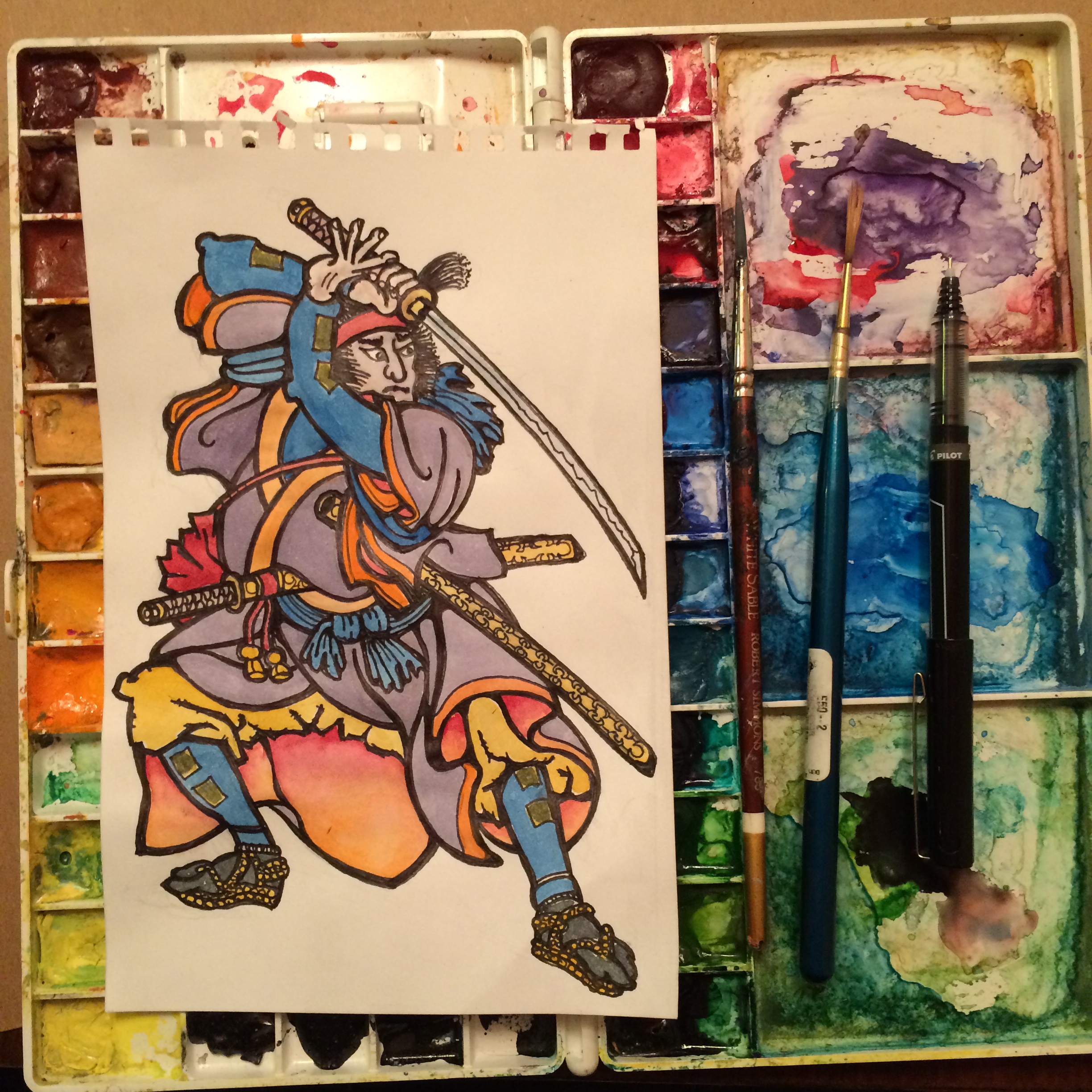
So…Samurai.
That’s what the content is for my series that is opening at The Goodfoot. It’s really and extension of my inspiration from classic Japanese woodblock prints. I wanted to do more samurai last year and just didn’t have enough time. It’s all part of a bigger picture that I’ll get into later. For now, I’ll just start sharing some images.
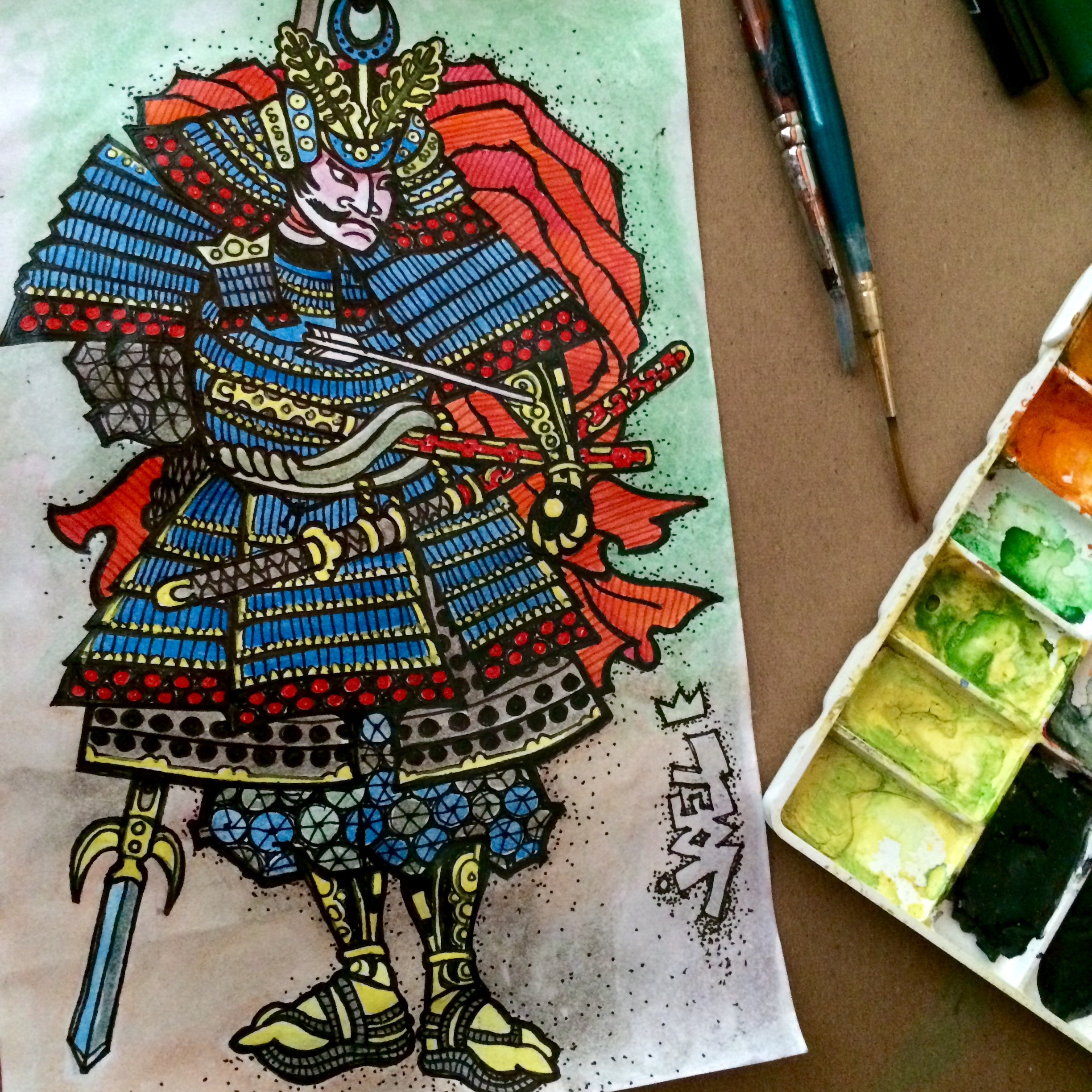

Transferring small study with pen and ink into larger format brush and ink illustration.
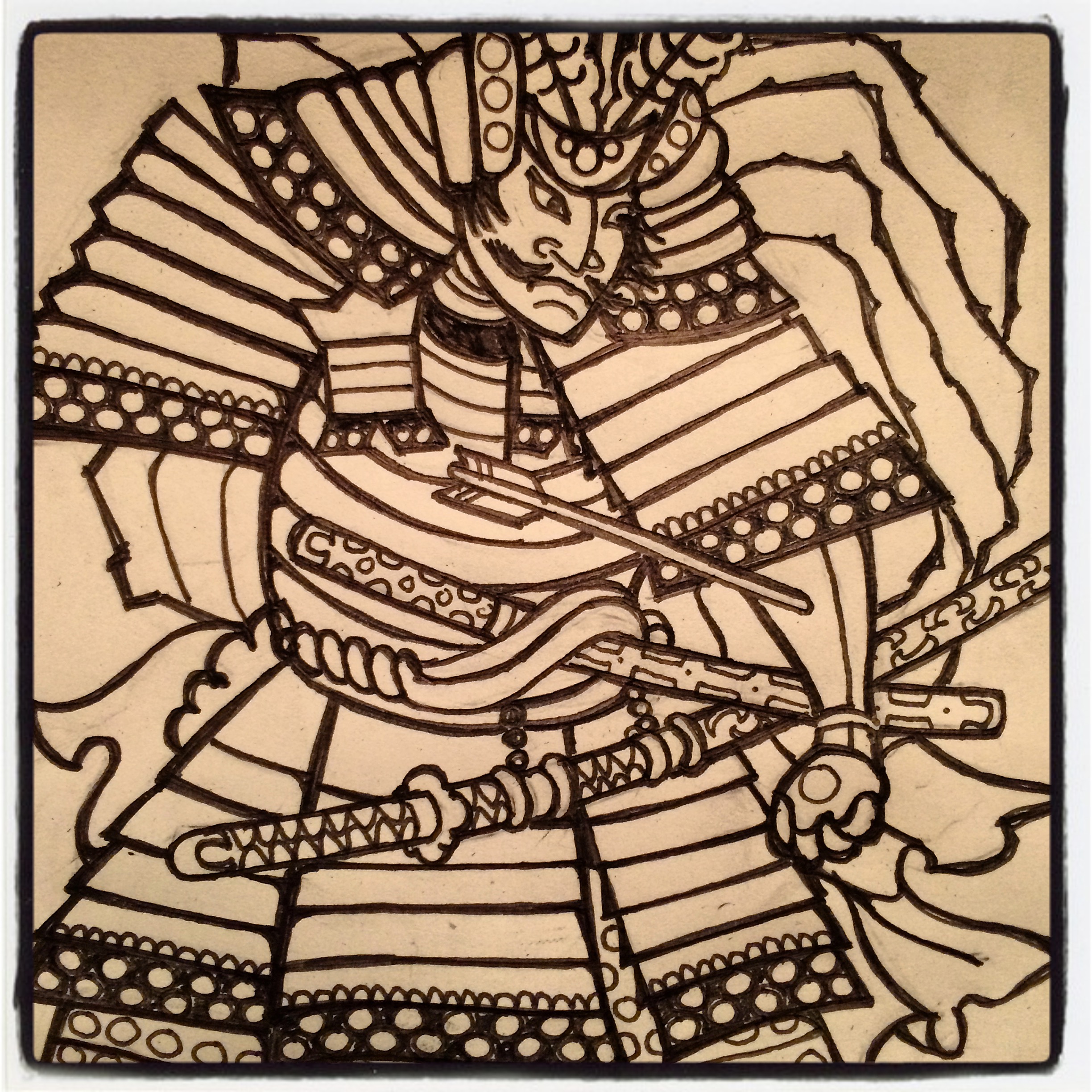
Ink on Paper
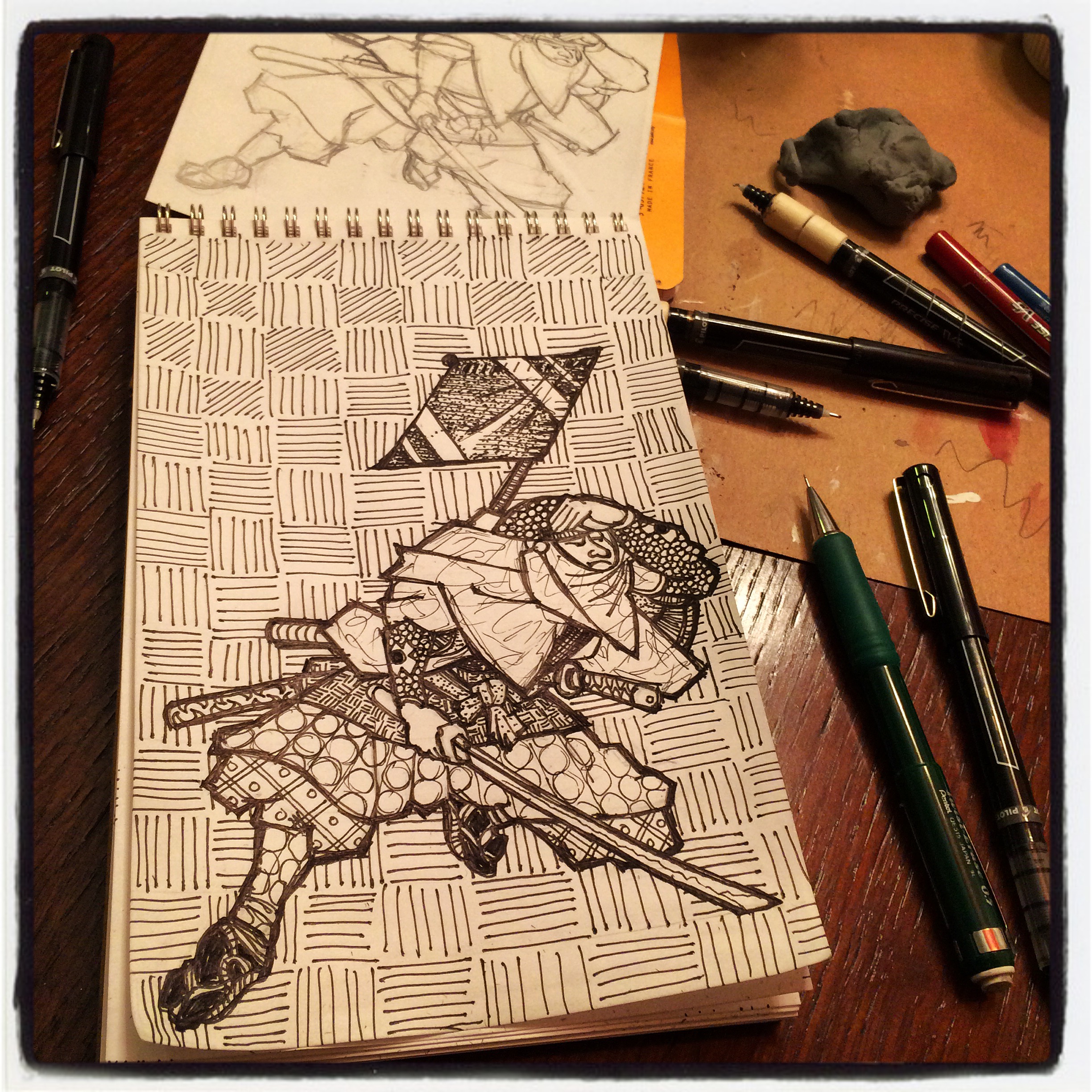
Pen and Ink
Ronin Study
Pen and Ink with Watercolor
Just Add Water (abstract landscapes from space)
Sometimes artwork just makes more sense when put into context! As I’m writing this, there are 15 abstract landscapes hanging at The Goodfoot and they are labeled “Abstract Landscape #3” etc. and I’ve started thinking that the typical viewer isn’t going to spend enough time with them to figure out that they are worked up from satellite photos. I think they look a bit like sixties geometric art, which is cool; however, I find it more interesting to know that they are real places that exist in Oregon.
I’ve wanted to paint versions of large scale man-made compositions, since flying home from Los Angeles years ago and photographing suburban cul-de-sac patterns as we flew north. Years later, Google brought us Google Maps and Google Earth and now we can fly everywhere, looking for pattern and composition. I started with Oregon and was drawn to the irrigation circles created by agriculture in the dryer central regions of the state. Many of the screenshots that I snapped are areas near Klamath Falls and Christmas Valley. I took notes on the locations; in retrospect, I wish that I’d copied down latitude and longitude coordinates. In the future, I’ll be more specific with my titles!
 My process involved cropping the screenshots from Google Maps, printing black and white versions at 8×8 inches, and using an architect ruler to scale the 8″ size up to 24″ square. Then I just used a pencil and T-square to map the fields and roads as closely as I could. The circles were traced around vinyl records of various sizes and some other circles I had around. The painting was done in many transparent glazes, sanding in between. I used masking, stenciling and both acrylic on a brush and airbrush. My goal was to stay close to the original color scheme and light/dark values. Here’s some Google shots vs. my final paintings. Obviously the Google shots are on the left. I’ll label each one with the approximate location in Oregon. Have fun spotting differences!
I tracked down all of the locations and linked them to the captions but for some reason, they aren’t working; if you copy the caption and paste it into Google Maps, each one should take you to the location so you can browse around the surrounding areas if you like. I’d love to see some of your favorite compositions as well and if you are in the area, photos from ground level would be pretty sweet too!! Enjoy!

Swan Lake Rd & County Highway 960, Poe Valley, Klamath, Oregon 97603

Poe Valley, South Poe Valley Road, Klamath, Oregon 97603

Homedale Rd & Oconner Rd Merrill, OR 97603

Between Hwy. 97 and Lower Klamath Lake Road

Between Highway 97 and Rangeline Drain Road

high pass road and washburn lane, junction city, or

Sagewood Drive and Stonehouse Road, Christmas Valley, Oregon

Co. Road 5-12B & Co. Road 5-12D, Christmas Valley, Oregon

Co. Highway 5-14D & Co. Highway 5-14E, Christmas Valley, OR

HIll St. and Crack-in-the-ground road, Christmas Valley, OR

County Road 5-10D Silver Lake, OR 97638

Gloria Rd & Fermac Silver Lake-Fort Rock, OR 97641
Face to Face
…some talk about stylistic choices.
I’m working backwards in time here, which is interesting to me, because these posts will appear in reverse order. When I sort some photos, I’ll talk about my creation process but for now I’d like to talk about my idea process during this series. Originally, my idea was to grid out nine panels 3×3 on the wall; however, I decided that should happen later and focus on color more than texture. These 8 panels (the ninth, incomplete) became quite textured as I compulsively added layers and pattern and I thought it best to display them so the audience can get close to each of them, as they have their own features.
Each of the eight started exactly the same, with a panel of mahogany plywood that was sanded and the sides boxed in. The same image (face) was mapped on all eight and, from here, the styles began to diverge. I have no concrete plan of execution when I begin, other than the starting point. Chance comes into play.

The first composition that I mapped was “Bump”. Using a slide of the very first painting in which I used this image, I project and trace the contour. Even my hand movements during this process, begin to create individual form. When I completed this linework and turned up the lights, I realized that the image was shifted about 8 inches to the left from where I’d intended. I bumped the panel! So, I decided that would be a good place for some text. The word “Bump” has so many connotations, that I couldn’t pass. When choosing a color scheme, I picked sexy colors that might be used in lipstick and eyeshadow. Bump alludes to dance clubs, sex, drugs, and loud music, so it seemed appropriate.
 Several more motifs developed after I had added the first two or three layers of color. I set all of the pieces outside, and stared them down while drinking my morning coffee. I made notes that I taped to the panels, based on the current feel of the color and how attached I was to the current level of awesomeness in the natural woodgrain or staining/glazing effect. I chose some warm and cool colors when shopping for this series, and began thinking about relationships and harmony. Color theory came into play here, more that usual. “Made It!” is essentially two themes: secondary colors (triad) and alternating stripe pattern. There are two shades of each color. The text/title, unrelated to the color scheme, refers to following thru with an idea. (Well, I guess I did follow thru with this theme, but it can relate to bigger issues…)

“Too Subtle?” is focused on analogous color (colors adjacent on the color wheel), in this case they are red/orange/yellow. I limited my use of pattern and alternated opaque color with transparent, which maintained the natural woodgrain. With some of the panels becoming quite abstract and pattern heavy at this point, it was important for me to keep a few pieces more simple and the values correct, so the face is more apparent.

“Maybe Knot” is one of the pieces that developed because of the woodgrain. There is a wonderful burl on the right side, which is somewhat obscured by the blue faux woodgrain. This piece was designated as blue/orange color scheme (complimentary colors) and the text was originally “knotty”, because I love the pun; however, I don’t like the way the word looks when I write it out. I like the balance of patterns here: dots, stripes, natural and faux woodgrain. All of my text was handwritten and stencil cut on the surface, some in positive and some in negative.

The faux woodgrain is a new technique for me. I’ve been interested in trying it for some time and have often talked about it with my friend and collaborator, Natalie Oswald. She uses it so effectively that I’ve witnessed people viewing a painting with pink woodgrain over collaged vintage magazine pages and say “Oh, I love it when people paint on wood.” No joke. In this faux piece, I attempted to give clues, by going against the natural grain at first, but then also alternating direction in other layers, and using very unnatural colors. I believe the early notes suggested “blue green pop”. I couldn’t bear covering the orange stain and natural/faux woodgrain combo, so the end scheme seems to be secondary-triad-with-some-blue…or (i’m nerding out here) purple/blue/green analogous with blue’s compliment: orange. That makes things symmetrical on the color wheel. I really think about these things…I know…maybe too much. Just wait, I’m working on converting these color harmonies into musical chords and vise versa. It will get nerdier.

The early notes that I made for “Spark” suggested that I exploit the iridescent copper that was used in the early washes, and I’d planned on adding some light blue to mimic patina. After a few more layers, some subtle woodgrain and richer colors, I was really getting the feeling of scorched wood. So rather than basing my color harmony on theory, I worked to suggest flame, singed wood, glowing coals and billowing smoke. The faux woodgrain, here, doubles as flame, the lips are dotted randomly to hint at glowing embers, and that copper underneath works to give ita all some glow. I enjoy the feel of this piece and will most definitely approach future pieces with this idea of mood.

A somewhat different approach was taken with this piece. I kept the palette simple: red/purple/blue (analogous). “Twice” describes the fact that I basically painted it two times. I did no spraypainting and did not mask the edges of any layers. I masked vertical stripes, evenly spaced, and then painted it all somewhat loosely, with a brush. Then I pulled the tape, and covered the stripes that I’d just painted and then re-painted everything (in the previous covered stripes). The result is two paintings, that occur in alternating stripes. It’s a pretty pleasing effect that I’ve been wanting to try again, since one of my collaboration experiments with Natalie. This was also a much less tedious process, since I didn’t have to apply and peel so much masking tape.
 It is interesting to me that “Crushed” seemed to get more compliments than the other pieces at the show. I think this is partially because my light and dark values are fairly accurate and the face reads easily. The simple palette is very close to so many of the early works that were done with this same composition, back around 2000-2003. It interests me that crushed is a word that means almost opposite things, but both are feelings that can be attributed to releationships/love. This is the last piece for this batch of eight, and the approach was slightly different, because I was not trying to keep any of the woodgrain in this one, or any of the early washes or glazes, which were not very interesting. My masking technique for most of the pieces works somewhat like this: I mask everything out, leaving only the area I’m going to paint, then I paint it, then I remove all of the tape and remask the area so that it is protected as I move on to new areas. (More on this in the future.) With “Crushed”, I worked in a sort of reduction process, like a woodblock print, painting a layer and covering it, painting the next layer and covering it and so on until it was all finished. Then I added the text, which is freehanded and hand cut.
These are some of my thoughts about each piece and the reason they look the way they do. I’ve not talked much about my masking techniques, glazing, color mixing, paint choices, mediums, stencils, etc. but I will in future posts. I’ve taken a lot of photos throughout the process, with this series and with many other paintings. I hope that you found this interesting; if so, please let me know and feel free to ask questions! Cheers!
Crushed at the Goodfoot!
Art Show: Goodfoot. (Portland, OR)
Showing now through March.
I’m excited to have a featured show at the The Goodfoot. Curated by Jason Brown (and Chris Haberman), it is one of my favorite art venues in Portland. I’ve been a fan of the Goodfoot Lounge since they opened ten years ago, enjoying the live music in what some have called “Portland’s Livingroom”. The upstairs, however, is a few years newer, more spacious with high ceilings, and ample wall space. The reputation as “an artist hang-out” seems appropriate; it’s definitely one of my hot-spots.
This show features Adam Sheppard, Johnny Tragedy, Tripper Dungan, and Joel Barber (That’s Me). Although, our themes and styles vary, we all sure like to use color! My contributions include my “Interface(redux)” series, which was finished moments before the show opened, and a recent series that I call “Just Add Water“. It’s satisfying for me to show these two series together, as they represent abstractions of two elemental subject matters: landscape and the figure.
This is a paragraph from the artist statement for the show:
Joel’s work has often paired mechanical techniques and graphic design style with painterly texture, and natural material such as woodgrain. The influence of pop culture, graffiti art, and graphic design affect his interpretations of traditional landscape and figure. Visually, Barber dwells in the area where there is an oscillation between the paint on the surface and the image contained within.

Face Time! New Painting Series.
-
-
-
-
- These images are from my first painting series of 2011. I will probably continue with this series for a while; these are the first 8 to be completed, for a 4 person show at Portland’s Goodfoot. One reason that I’ve started this blog is to document some of my process and technique. This series will give good context for in-process photos because the repeated image will provide us with some visual context. Here’s a paragraph from my artist statement for the Goodfoot show:
-
 “Crushed” Joel Barber (2011) 40×30 inches, acrylic on mahogany
“My first very prolific series began in 1999, in which I manipulated closely cropped photos of women’s faces, with photoshop, and used these images to map out compositions on canvas. It was an excellent experiment because the repetition gave great context and a reference point for the effectiveness of each style or technique. Now, I’ve returned to these same compositions, curious to see how the last decade has affected me stylistically.”
 “Made It!” Joel Barber (2011) 40×30 inches, acrylic on mahogany
"Faux." Joel Barber (2011) 40x30 inches, acrylic on mahogany
 “Maybe Knot” Joel Barber (2011) 40×30 inches, acrylic on mahogany
 -
 “Spark” Joel Barber (2011) 40×30 inches, acrylic on mahogany
 -
 “Too Subtle?” Joel Barber (2011) 40×30 inches, acrylic on mahogany
 -
 “Twice” Joel Barber (2011) 40×30 inches, acrylic on mahogany
 -

 “Bump” Joel Barber (2011) 40×30 inches, acrylic on mahogany
